In this short post I would like to show you how to create CSS3 animations. For this I will assume that you have some basic knowledge about HTML and CSS. This should not take more than 5 minutes to read and after reading it you should know almost everything you need for creating your own CSS animations.
A CSS animation actually takes one or more CSS style attribute value of an HTML element and varies it over time resulting in the element to look like it’s animated.
The simplest CSS animation
The very basic of CSS animation is done using the transition style attribute. This is used to indicate which CSS attribute of an element you want to modify (animate) and how long should the transition take. Let’s see a simple example:
In this example I have a centered anchor link that will bounce up by 20px on mouse hover. This CSS animation is achieved by setting a transition attribute in the link’s styles. I indicate that I want the transition to only affect the margin-top style attribute and that I want the transition to take a third of a second.
I want to point out 2 less obvious things here. One is that I have placed the transition attribute on the bouncy class and not on the bouncy:hover. As a result on mouse hover the margin-top is smoothly transitioned from 0 to -20px within .3 seconds, but also on mouse out the transition is performed in reverse. If I had placed the transition attribute only in the bouncy:hover class it would have been applied when hovering over the link, but then on mouse out it would have snapped in the original position without any transition.
The second thing I want to point out here is that I have indicated that the transition only applies to the margin-top attribute. I also have the option to indicate multiple attributes by comma separating them (eg. transition: margin-top .3s, font-size .5s;) and I can even indicate that I want to transition all attributes (eg. transition: all .3s;).
A less simple CSS animation effect
Now that we know about transitions, let’s go further and modify the previous example a bit. Let’s activate the transition when the link is clicked. To do that we will add a click listener and toggle the bouncy-hover on the link element. Toggle means that if the element has the class when it’s clicked then it will remove the class, if it doesn’t have it, then it will add that class.
So, when you click the link it goes up 20 px. Click again and it goes back to the original position. That looks pretty nice, but since I named the class bouncy, I would really like to have the link bounce. To do that we need to define an animation.
Key frame CSS animation
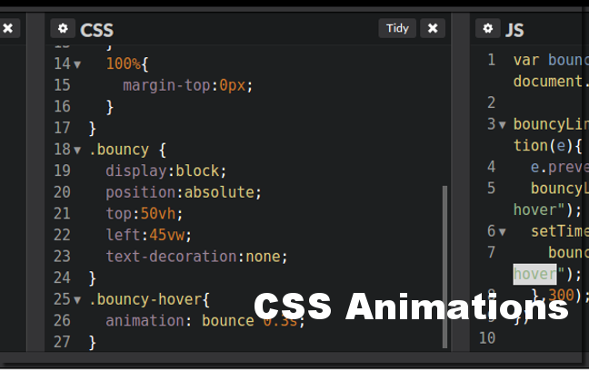
A CSS animation is defined by indicating values for CSS attributes at various key frames. The key frame concept should be familiar to you if you have ever worked with any sort of animation software. Basically for a CSS animation you need to define a @keyframes element, give it a name which will become the name of the application, and then indicate the CSS attributes at certain moments during the animation by using a percentage. 0% is the start of the animation and 100% is the end.
But enough words, let’s see an example.
So, first of all I defined an animation called bounce using the @keyframes element. The bounce animation starts at 0%, moves the link up by 20px at 50%, and then bounces back, but overshoots the original position to add to the bounce effect.
The second thing I did was to add the newly created animation to the bounce-hover class. This was done by adding an animation attribute with the name of the animation and the duration.
Lastly, I pulled one trick in the JavaScript code. When the link is clicked the bounce-hover class is added to the link and then in 300ms (the same as the .3s animation duration) the class is removed. I had to do this because otherwise the link would have bounced only once out of 2 times.
I hope you found this CSS animation tutorial useful. As always if you have any questions or remarks please don’t hesitate to drop me a comment below.

[…] look better with animations. If you want to start off quickly with simple animation just read my 5 min tutorial on CSS animations. In real life however you will probably have to integrate animations in applications a bit more […]
[…] the Earth around the Sun. If you have not used CSS animation so far, I suggest first reading the 5 min CSS animation beginner tutorial and then coming back to […]