Creating CSS tooltips is not that difficult, you just need to know what you want to achieve, and you need to be aware of some CSS tricks. In this post I will tell you all you need to know for making your own CSS tooltips.
What maketh a tooltip
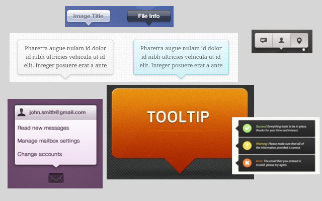
A tooltip is usually a text box that only appears when you go with the mouse over an HTML element. The HTML element can be one or more words or even images.
The tooltip is meant to provide extra information about a word or words. Tooltips are preferred in some cases because information contained in them would not fit directly in the text to which they refer, or would be too much a distraction for the reader.
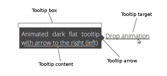
As shown in the picture, a CSS tooltip (and any other type of tooltip) always has a set of components:
- Tooltip target – is the piece of text, image or other element which the tooltip explains. Most of the times the tooltip will be hidden. It is only shown when an action performed on the tooltip target: either a mouse click, but more often on mouse over.
- Tooltip box – the container for the tooltip is usually a box or rectangle with or without borders, but definitely different than the rest of the content such that it pops out of it. The box hovers over the text to isolate itself from it and to draw attention to the tooltip target that it explains.
- Tooltip content – inside the tooltip box comes the tooltip content. The content is usually text, but it can also contain HTML content (images, etc.)
- Tooltip arrow – optionally tooltips have arrows or pointers that point toward the tooltip target.
Simple CSS tooltip example
I like simple things, so when I want to implement a CSS component, the first thing I do is try to create the simplest version of the component I can think of. I did the same thing in one of my older posts about creating simple CSS glossy buttons. And here’s my version of the simplest CSS tooltip:
See the Pen CodingDude – Simple CSS Tooltip by Ion Emil Negoita (@codingdude) on CodePen.
If you look in the CSS code (HTML tab) you will see that the tooltip target is a span element marked with the CSS class simple-tooltip. The tooltip target is marked in bold to indicate that the user can perform an action on it.
...sit amet <span class="simple-tooltip">tooltipus (hover over me)</span>, consectetuer adipiscing...
In the CSS tab you can also see that the trigger for the tooltip is the mouse hover event (marked by :hover). :hover is a pseudo CSS selector and it’s used to indicate how the element on whichi is applied should be styled when hovering with the mouse over it.
Together with the :hover I’ve another pseudo selector :before. Used like this and together with the content attribute I can indicate that I want an extra element added before the element over which I’m hovering with the mouse – the CSS tooltip. This element is the tooltip box. The content attribute is the tooltip content.
simple-tooltip:hover:before{
 font-weight:300;
 content:'This is a simple CSS tooltip';
 bottom:100%;
 left:50%;
 width:130px;
 position:absolute;
 background-color:#444;
 border:1px solid #444;
 text-align:center;
 padding:10px;
 color:white;
 text-shadow:1px 1px 0 black;
}
This simple CSS tooltip example can be used as is in many situations, but it has some obvious shortcomings. The major one is that the content of the tooltip can only be text. Trying to insert any kind of HTML tags in the content attribute will fail. You might be able to do some clever tricks like setting a background image and such, but that would be stretching it a bit.
Here’s my attempt at a better CSS tooltips library.
A library for CSS tooltips
I know it’s not actually a library, but hey, it’s free, it’s working and it allows making tooltips doing pretty much all the things that a tooltip should do. And it’s CSS only so NO JavaScript.
See the Pen CodingDude – CSS tooltips by Ion Emil Negoita (@inegoita) on CodePen.
With this library I’m taking a different approach than in the simple CSS tooltip example above. I am using an HTML element as the tooltip so that I can put in it any kind of HTML tag I want. Most tooltip implementations will do something similar.
Let me describe what the library contains and how it actually works. You can freely use this library in your projects and I would really appreciate any feedback you might have.
Basic CSS tooltip classes
.tooltip-target
This is the CSS class that marks the tooltip target (how imaginative of me).
.tooltip
This CSS class marks the tooltip content HTML element. This should be inside the .tooltip-target element.
This CSS class initially hides the element until you hover over the tooltip target. The tooltip target has a position set to relative and the tooltip has the position set to absolute. In this way the tooltip floats out of the containing element.
...
tooltip-target{
 position:relative;
}
.tooltip{
 pointer-events: none; /*the tooltip does not respond to mouse events*/
 opacity:0; /*tooltip initially is not visible*/
 position:absolute;
...
Besides the basic styles I’ve defined a few extra styles, that you can add for various looks and effects.
Rectangle or rounded
.flat-tooltip or.flat-rounded-tooltip
I’ve defined two types of tooltip styles: a regular rectangle shaped tooltip and a tooltip with rounded corners. The rounded corners are defined by the border-radius attribute.
.flat-rounded-tooltip{
 padding:5px;
 background-color:white;
 border-radius:10px;
}
CSS tooltip placement
.above, .below, .right, .left
Use one of these four CSS classes to specify where to place the tooltip next to the tooltip target.
CSS tooltip arrow
.arrow-top, .arrow-bottom, .arrow-right, .arrow-left
To add an arrow to the tooltip use one of these four CSS classes. These classes make clever use of a CS trick which I must admit that is not my idea. The trick combines two borders that overlap, the :before and :after pseudo selectors and create a wedge that looks like an arrow. Because it is so clever I just have to give full credit to this website for this arrow CSS trick.
...
.arrow-right:after {
 border-left-color: white;
 margin-top: -8px;
}
.arrow-right:before {
 border-left-color: #ccc;
 margin-top: -10px;
}
...
CSS tooltip visual perks
.shadow
This CSS class will add a shadow around the tooltip box.
.glossy
This CSS class will add a glossy finish to the tooltip box.
.dark
By default the CSS tooltip is white with black text and light gray borders. With the .dark CSS class you can activate the dark theme for the tooltip which will create a dark gray box with white text.
CSS tooltip animation effects
.fadein
Use this CSS class to create a fade in effect when the tooltip is activated. This effect is achieved with two CSS attributes: the transition attribute specified for opacity (which is initially 0) and the opacity attribute set to 1 when the tooltip is activated. You can define CSS transitions by indicated the attribute for the transition, the duration of the transition and the algorithm used.
The transition attribute has browser specific forms. Here are the relevant sections of the CSS stylesheet:
...
.tooltip{
 pointer-events: none;
 opacity:0;
...
.fadein{
 -webkit-transition: opacity .8s ease;
 -moz-transition: opacity .8s ease;
 -ms-transition: opacity .8s ease;
 -o-transition: opacity .8s ease;
 transition: opacity .8s ease;
}
...
.tooltip-target:hover .tooltip.fadein{
 opacity:1;
}
...
.drop
Use this CSS class to have your tooltip appear like it’s dropping from the top of the screen. This effect is also achieved using the transition CSS attribute, but set for the margin attribute.
Here is the extract from the CSS stylesheet:
...
.drop{
 -webkit-transition: margin .8s ease;
 -moz-transition: margin .8s ease;
 -ms-transition: margin .8s ease;
 -o-transition: margin .8s ease;
 transition: margin .8s ease;
 margin-top:-100%;
}
...
.tooltip-target:hover .tooltip.drop{
 margin-top:0;
}
...
I really hope you found this post useful and I’m looking forward to your comments, remarks, suggestions, questions, etc. Please share if you liked it!