Creating a simple glossy button with CSS is quite easy and you only need to know a few CSS tricks. In this post I will show you how to create a glossy button out of an anchor tag using only CSS. At the end of the post you can find the live demo for these glossy buttons.
First let’s start with some theory.
Why glossy buttons from anchor tags?
I will create the glossy buttons from an anchor tag. This is quite useful for a number of reasons, especially from the point of view of search engines. You want to have a nice looking button on your website, but what do you know, search engines don’t really like <input type=”button”/> tags. They do however love <a href=””/> tags.
What Elements Does A Button Have?
A button is something that you click. Everybody knows that. Well, there are some things about a button that are not quite that obvious when describing a button, but become obvious if the button is missing those things.
For example:
When you click the button you expect it to change look in such a way that it feels like you actually push it. This is sometimes called a visual feedback.
Also, buttons usually change color when hovering with the mouse over them and you expect the mouse cursor to be different than the default arrow cursor. Even a detail like if one can select the text in the button or not adds to the feel of a button – usually text on buttons is not selectable.
Glossy Buttons CSS Code
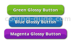
Here are the working buttons:
Green Glossy Button
Blue Glossy Button
Magenta Glossy Button
.glossy-button {
text-shadow:0 0 2px #000;
border-radius:10px;
color:#FFF!important;
cursor:pointer;
display:inline-block;
font-family:'Open Sans', sans-serif;
font-size:15px!important;
font-weight:700!important;
line-height:25px;
text-decoration:none!important;
-webkit-touch-callout:none;
-webkit-user-select:none;
-khtml-user-select:none;
-moz-user-select:none;
-ms-user-select:none;
user-select:none;
margin:4px;
padding:4px 20px;
}
You can use the CSS class glossy-button for any anchor tag like this
<a class="glossy-button" ... >Your button text</a>
The only thing you have to add is color. I separated the CSS styles such that you have one CSS class for the basis for the glossy button and another class for the color. For example, the green glossy button below has the following CSS class:
.green:active {
background-color:#72b427;
box-shadow:inset 1px 1px 2px #72b427,0px 0 3px #000, inset 0 18px 0 #83ca32 !important;
}

.green:hover {
background-color:#72b427;
box-shadow:1px 1px 5px #000,inset 1px 1px 2px #72b427,0 0 2px #83ca32, inset 0 18px 0 #83ca32;
}

.green {
background-color:#68aa1a;
box-shadow:1px 1px 5px #000,inset 1px 1px 2px #87cc35,0 0 2px #68aa1a, inset 0 18px 0 #78bf25;
}
The CSS class green sets the colors for the glossy button normal state, mouse over state and pressed state (:active). I’ve highlighted the colors that you need to change to create your own color for the glossy button. To use this color on the button you need to do this:
<a class="glossy-button green" ... >Your button text</a>
Here is the code for the blue and magenta buttons:
.blue:active {
background-color:#2765B4;
box-shadow:inset 1px 1px 2px #276BB4,0px 0 3px black, inset 0 18px 0 #327BCA !important;
}

.blue:hover {
background-color:#276BB4;
box-shadow:1px 1px 5px #000,inset 1px 1px 2px #276BB4,0 0 2px #327BCA, inset 0 18px 0 #327BCA;
}

.blue {
background-color:#1A65AA;
box-shadow:1px 1px 5px black,inset 1px 1px 2px #357DCC,0 0 2px #1A6BAA, inset 0 18px 0 #2581BF;
}

.magenta:active {
background-color:#9227B4;
box-shadow:inset 1px 1px 2px #9227B4,0px 0 3px black, inset 0 18px 0 #9F32CA !important;
}

.magenta:hover {
background-color:#9227B4;
box-shadow:1px 1px 5px black,inset 1px 1px 2px #8727B4,0 0 2px #9F32CA, inset 0 18px 0 #9F32CA;
}

.magenta {
background-color:#7C1AAA;
box-shadow:1px 1px 5px black,inset 1px 1px 2px #A835CC,0 0 2px #8D1AAA, inset 0 18px 0 #A025BF;
}
I hope you enjoyed this short tutorial on how to create glossy buttons with CSS. If you have any questions or requests for other tutorials similar to this, please drop me a comment. I try to respond to all comments withing a few days.
Also, make sure you subscribe to the CodingDude Newsletter for more tutorials related to web development, programming and SEO.

[…] of the component I can think of. I did the same thing in one of my older posts about creating simple CSS glossy buttons. And here’s my version of the simplest CSS […]
[…] one of my old post I shared the glossy button CSS code, but that was very basic CSS coding. In this tutorial I will show you some more advanced CSS […]