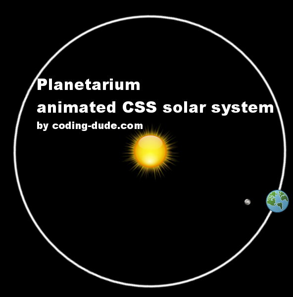
In this post I will show you how to create a so called planetarium CSS solar system. Basically I will use CSS animations to animate a representation of our solar system. Actually I will only represent the movement of the Moon around the Earth, the rotation of the Earth around its own axis and the revolution of the Earth around the Sun. If you have not used CSS animation so far, I suggest first reading the 5 min CSS animation beginner tutorial and then coming back to this.
Planetarium – CSS Solar System
I tried to make this Planetarium accurate from the timing point of view. I cannot make it accurate from the scale point of view since the Sun is huge in comparison to the Earth and you would not be able to see it properly.
To represent the planets I used 3 images:


CSS Solar System
Then, I setup 3 levels. The first top level is the solar system div, which contains everything. Inside that I placed the Sun in the center like this:
.solar-system{
 width:800px;
 height:800px;
 background-color:black;
}

.sun{
 position:absolute;
 margin:calc(400px - 60px) calc(400px - 60px);
 display:block;
 width:120px;
}
Since the size of the solar system div is 800 x 800, I had to move the Sun first by 400 x 400 and then to pull it back by 60px which is actually half of the 120px size of the Sun.
CSS animation of the Earth rotation
There is no animation for the solar system so let’s take a look at the next level, the div named earth-orbit. This holds the Earth image and also the Moon, since both the Earth and the Moon will have to go around the Sun. Also, the Earth moves around its axis. The first CSS animation is this rotation of the Earth around its axis and it’s achieved like this:
.earth{
 width:50px;
 top:400px;
 left:100px;
 animation:earth-rotation 1s infinite linear;
 position:absolute;
}
...
@keyframes earth-rotation {
 100% {
 transform: rotate(-360deg);
 }
}
I indicate a @keyframes animation called earth-rotation via the animation CSS attribute. I scaled the time line such that 1 second represents roughly one day, so since the Earth takes one day to rotate around its axis, the rotation animation duration is set to 1 second. Also, I indicate that the animation should be repeated in a loop via the infinite value, and the transition between states of the animation should be linear.
Let’s take a short look at the @keyframes animation itself. It’s pretty self explanatory saying that at 100% of one complete look it should have rotated the element by 360 degrees. The minus just indicates that the rotation should be counter clockwise, which hopefully is correct, “planetologically” speaking. So, since the duration of the animation is 1 second, it means that every second the element will be fully rotated around its axis.
CSS animation of the Earth revolution around the Sun
.earth-orbit{
 height:100%;
 animation:earth-revolution 365s infinite linear;

}

@keyframes earth-revolution {
 100% {
 transform: rotate(-360deg);
 }
}
The earth-orbit div spans the full size of our solar system div to allow the Earth to rotate fully around the center – the Sun. The @keyframes animation for earth-revolution is identical to the earth-rotation. There is a difference though in the CSS class earth-orbit. I’ve made the duration of the revolution animation 365 seconds for the 365 days in a year, consistent with the 1 day = 1 second assumption made for the other elements.
CSS animation of the Moon rotation around the Earth
.moon{
 width:15px;
 top:calc(400px + 25px - 50px);
 left:calc(100px + 25px - 50px);
 animation:moon-revolution 27.3s infinite linear;
 position:absolute;
 transform-origin:50px 50px;
}

@keyframes moon-revolution {
 100% {
 transform: rotate(-360deg);
 }
}
The @keyframes CSS animation for the Moon rotation is also similar to the other animations. The difference is that since we want the Moon to rotate around the Earth we have to first translate the Moon to the same spot as the Earth which is 400px down and 100px to the left plus half of the Earth’s size (25px) for the exact center. Then, we need to move the Moon on it’s orbit which I set to 50px.
Also, we need to move the transform origin by 50px using transform-origin:50px 50px. This will make the Moon rotate around the exact center of the Earth, and not its own center. The duration for the animation is 27.3s, equivalent to the 27 days and 7 hours (.3 seconds means a third of a day) it takes the Moon for a complete rotation around the Earth.
That sums up this post on how I created a fully working animated CSS solar system. I hope you enjoyed this and if you did please make sure you share this.


