

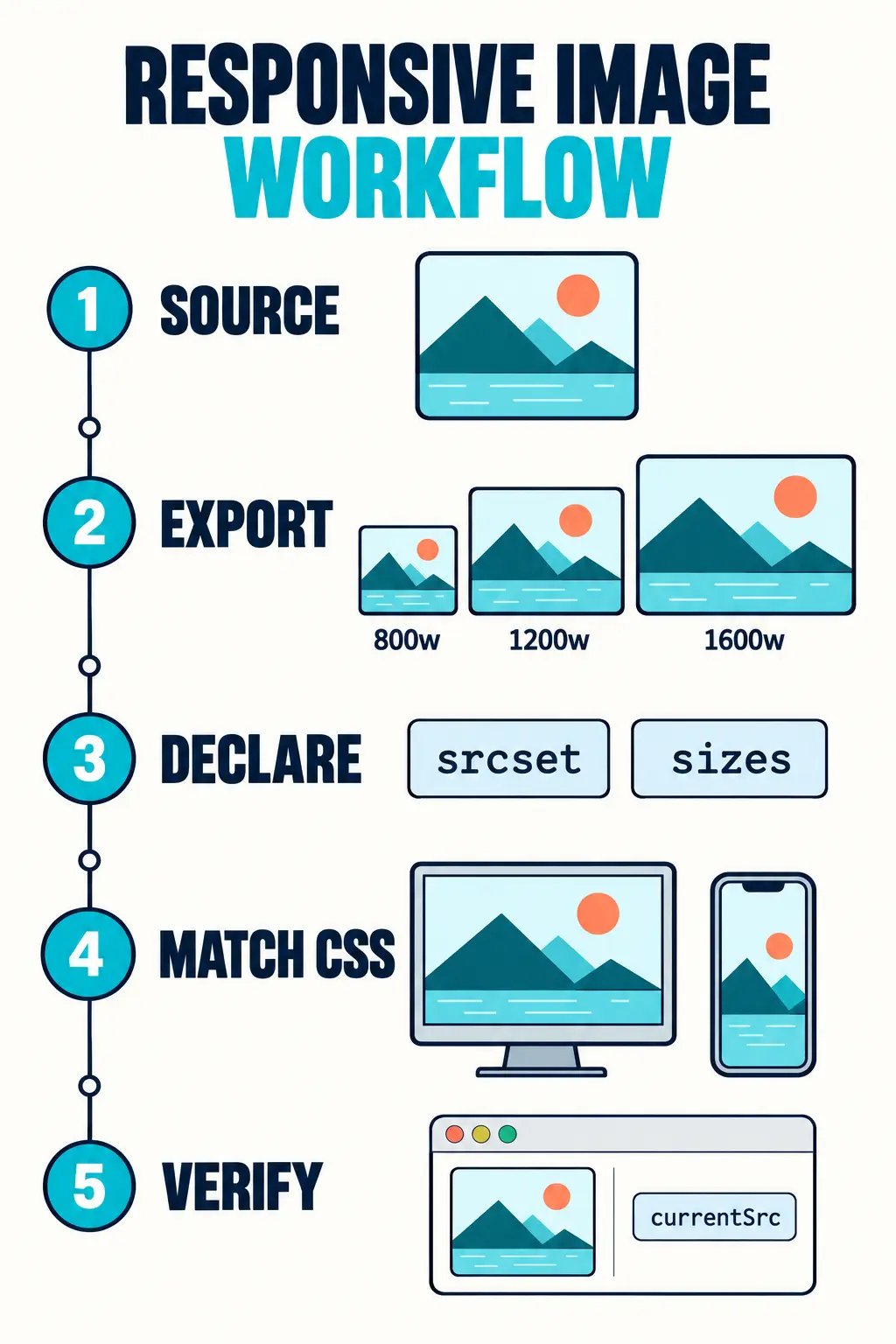
Quick answer: To serve responsive images in HTML, export the same crop at several real pixel widths, list those files in srcset, describe the rendered width in sizes, and keep a normal src fallback. The browser can then choose an appropriate file. You do not need Photoshop for the export step.
This is one of those jobs where a few lines of HTML can save a lot of unnecessary image data. But the markup only works well if the files behind it are prepared correctly. Let’s build a small example you can adapt to a project or a WordPress theme.

The example: one image, three widths
Imagine a tutorial illustration that appears at up to 800 CSS pixels wide in an article. The source image is 1600 × 1000 pixels. We want the same composition at three sizes:
tutorial-800.jpg— 800 × 500 pixelstutorial-1200.jpg— 1200 × 750 pixelstutorial-1600.jpg— 1600 × 1000 pixels
All three files have the same 8:5 aspect ratio. The smaller files must be actual resized exports; renaming a 1600-pixel file to tutorial-800.jpg will not make it lighter.
If your source is a layered PSD, keep a copy of that editable file before exporting. You can prepare the sizes in a browser editor. For tool choices, PSDDude’s guide to online photoshop alternatives is a useful shortlist. Check each candidate with your own PSD, especially if it contains fonts, masks, or effects. The coding steps below work with the exported images regardless of which editor you choose.
Responsive images in HTML: srcset and sizes
<img
  class="tutorial-image"
  src="/images/tutorial-800.jpg"
  srcset="/images/tutorial-800.jpg 800w,
          /images/tutorial-1200.jpg 1200w,
          /images/tutorial-1600.jpg 1600w"
  sizes="(max-width: 800px) 100vw, 800px"
  width="1600"
  height="1000"
  alt="Layer panel and canvas in a browser image editor"
  loading="lazy"
  decoding="async"
>
Here, 800w, 1200w, and 1600w describe the files’ intrinsic widths. They are not the widths at which CSS must display them. The numbers must match the actual exported files.
The sizes value says: when the viewport is at most 800 pixels wide, the image occupies approximately the viewport width; otherwise it occupies 800 pixels. The browser uses that hint, along with device pixel density and other factors, to choose a candidate. It is a selection hint, not an instruction to CSS to set the rendered width. The regular src provides a fallback.
The width and height attributes describe the image’s ratio so the browser can reserve space before it loads. They do not force the displayed image to be 1600 pixels wide. Match them to the ratio of the actual file. This detail helps avoid layout jumps.
The CSS: match your sizes promise
.tutorial-image {
  display: block;
  width: 100%;
  max-width: 800px;
  height: auto;
}
Now the CSS and the sizes attribute describe the same maximum width. In a narrower article column, however, 100vw might overstate the space the image really uses. For example, if the article has 16-pixel padding on both sides, a closer hint would be:
sizes="(max-width: 832px) calc(100vw - 32px), 800px"Use the value that matches your actual layout. Guessing too high can make the browser download a larger candidate than necessary.
If the image is meant to be a round avatar rather than a full-width illustration, the rendering rules change. Coding Dude’s CSS circle image guide covers that layout separately.
How do you check which image loaded?
Open the page in your browser, resize the viewport, and inspect the image in DevTools. The currentSrc property shows the file the browser chose. This console snippet prints the chosen URL and the rendered and intrinsic widths:
const image = document.querySelector('.tutorial-image');

function inspectImage() {
  console.table({
    chosenFile: image.currentSrc,
    renderedWidth: Math.round(image.getBoundingClientRect().width),
    intrinsicWidth: image.naturalWidth
  });
}

if (image.complete) {
  inspectImage();
} else {
  image.addEventListener('load', inspectImage, { once: true });
}
Run this on a page containing the example image. You can also look at the Network panel to compare transferred file sizes. Resizing an already-loaded page may keep a previously downloaded candidate in cache, so reload when comparing viewport sizes.
Note that naturalWidth can reflect browser processing rather than serving as a perfect audit of the source file’s byte dimensions. Verify the exported files directly when checking that the w descriptors are accurate.
What changes for WordPress?
If you insert an image through the WordPress Media Library, WordPress can generate intermediate sizes and output responsive image attributes for you. Inspect the rendered page before hand-writing another srcset. The manual example above is most useful when you control the HTML in a theme, template, or custom block, or when you are debugging an existing output.
Upload a source image large enough for the sizes you need, and check the files WordPress actually generated. A theme or plugin may register different image sizes. For a picture with a meaning, write useful alternative text in the Media Library; for a purely decorative image, use an empty alternative text value.
One more performance detail: this example uses loading="lazy" because it assumes the image appears lower down the article. If the image is a hero or likely to be visible in the first viewport, remove lazy loading so it can be requested promptly.
Common mistakes
- Incorrect
wvalues: The number insrcsetmust be the file’s actual pixel width. - Different crops in one
srcset: Use the same composition for resolution switching. If the composition changes for a small screen, consider a<picture>element for art direction. - A
sizesvalue copied from another layout: Write it for the width your CSS really produces. - No editable source: Keep the layered original so you can update labels or screenshots without rebuilding the graphic.
- Lazy loading the main hero: Save
loading="lazy"for images below the initial viewport.
Frequently asked questions
What is the difference between srcset and sizes?
srcset lists image files the browser may choose. sizes estimates how wide the image will appear at different viewport widths. Together, they help the browser select a suitable file.
Do I need Photoshop to make responsive images?
No. You need correctly sized image exports and suitable HTML. A browser-based editor can be enough for preparing the files; test a copy of a complex PSD before relying on it.
Should I write srcset manually in WordPress?
Usually, start by checking the output from the WordPress Media Library. Write it yourself when you control a custom template or need to debug a specific responsive-image setup.
Takeaway: Responsive images in HTML are a partnership between your asset pipeline and your markup. Export genuine sizes from the same source, make sizes match your CSS, and verify the selected file in the browser.
Further reading: MDN’s responsive images guide, MDN’s <img> reference, and WordPress responsive images documentation.