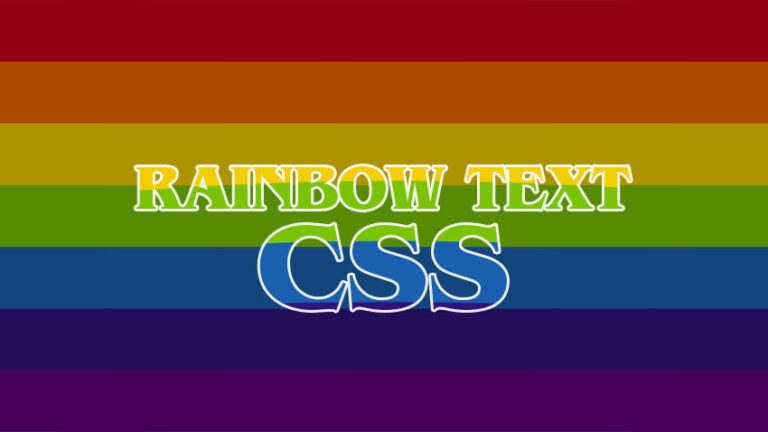
CSS RAINBOW TEXT: How to Create Rainbow Text with CSS
CSS, or Cascading Style Sheets, is a powerful tool used in web design to control the visual appearance of a website. With CSS, designers can create styles for various elements of a web page, including text, images, backgrounds, and more.
To create rainbow text with CSS, designers can use a combination of different CSS properties, including linear gradient and other CSS techniques. Each of these methods allows designers to specify a range of colors and transitions between those colors, resulting in a rainbow effect.
Creating Rainbow Text with CSS
1. Create Rainbow Text Using CSS linear-gradient
In this example, we’re creating a span element with the class rainbow-text.
In the CSS, we’re setting the background property to a linear gradient with the colors of the rainbow, creating a rainbow effect. We’re then using the -webkit-background-clip property to specify that the gradient should only apply to the text and not the entire element, and the color and -webkit-text-fill-color property to make the text transparent, allowing the gradient to show through.
HTML:
<span class="rainbow-text">CODING DUDE CSS RAINBOW TEXT</span>
CSS:
.rainbow-text {
background: linear-gradient(to right, red, orange, yellow, green, blue, indigo, violet);
background-clip:text;
-webkit-background-clip: text;
color:transparent;
-webkit-text-fill-color: transparent;
}
See the Pen Rainbow Text 1 by Ion Emil Negoita (@inegoita) on CodePen.
In the example above I’ve also added a few variants for the rainbow text. Only the background property changes with different types of gradents:
- vertical gradient:
background: linear-gradient(toright, red, orange, yellow, green, blue, indigo, violet); - horizontal gradient:
background: linear-gradient( to bottom, red, orange, yellow, green, blue, indigo, violet ); - oblique gradient:
background: linear-gradient(45deg, red, orange, yellow, green, blue, indigo, violet ); - radial gradient:
radial-gradient(circle at 50%, red, orange, yellow, green, blue, indigo, violet );
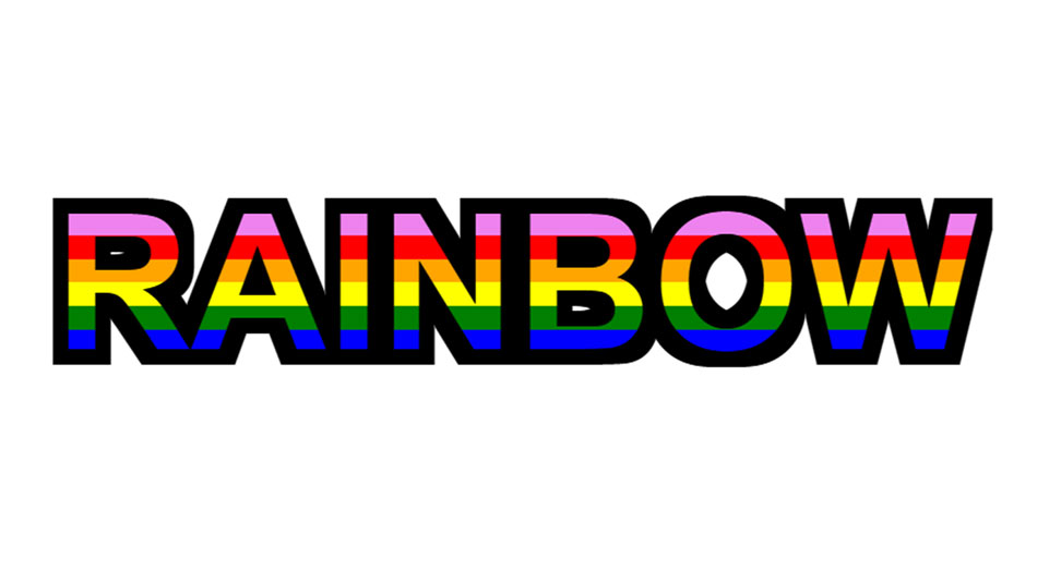
Alternatively, we can make the rainbow without the gradient transitions and display the rainbow as stripes.
Here’s the code and result of that:
See the Pen Rainbow Text 2 by Ion Emil Negoita (@inegoita) on CodePen.
To get the rainbow colors as stripes instead of having the colors fade into one another, we are using the same color twice in color stops that are close to each other like this:
background: linear-gradient(to bottom, red 0%, red 12.5%, orange 12.5%, orange 25%, yellow 25%, yellow 37.5%, green 37.5%, green 50%, blue 50%, blue 62.5%, indigo 62.5%, indigo 75%, violet 75%, violet 87.5%) 0 0.3em/100% 1em repeat-y;
For this example, I’ve used a SVG technique to add a nice black stroke to the text. You can read more about CSS Stroke Text in my definitive guide.
IMPORTANT: Note that the -webkit prefix is used for the background-clip and text-fill-color properties to ensure compatibility with some older browsers.
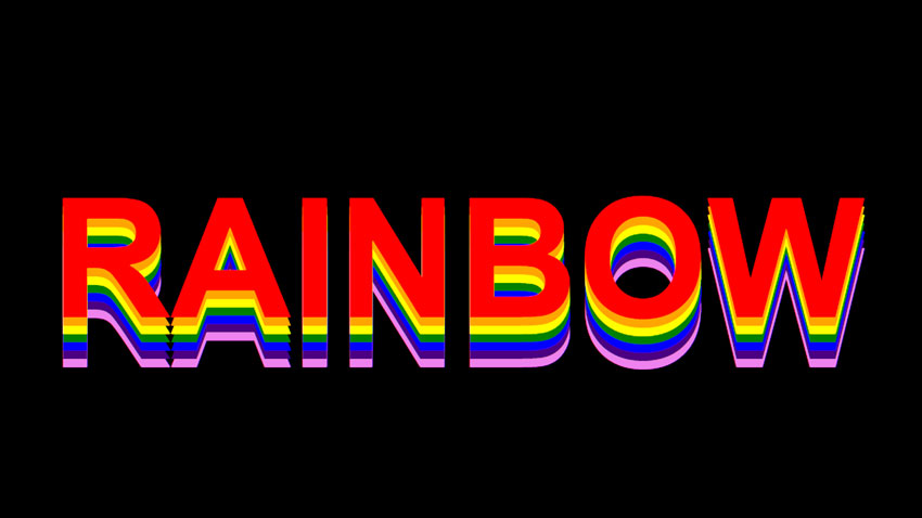
2. How to Make Rainbow Text in CSS With Shadows
To create a CSS rainbow text effect using multiple CSS shadows, you can use the stacked text shadows method, where you add multiple text shadows with different colors and offsets, or the colored letters method, where you make each letter a different color by using a span element and the :nth-child selector, or the CSS gradient method, where you create a CSS gradient.
See the Pen Untitled by Ion Emil Negoita (@inegoita) on CodePen.
The CSS code for the stacked text shadows that creates the CSS rainbow text effect is this:
color: transparent;
  text-shadow:
    0 calc(1 * var(--shadow-space)) 0 red,
    0 calc(2 * var(--shadow-space)) 0 orange,
    0 calc(3 * var(--shadow-space)) 0 yellow,
    0 calc(4 * var(--shadow-space)) 0 green,
    0 calc(5 * var(--shadow-space)) 0 blue,
    0 calc(6 * var(--shadow-space)) 0 indigo,
    0 calc(7 * var(--shadow-space)) 0 violet;
The CSS text-shadow style, as described here, allows multiple shadows to be configured for the text, each shadow configuration separated by a comma in this format:
/* offset-x | offset-y | blur-radius | color */I’m using the CSS variable --shadow-space to offset each rainbow text color by a configurable amount. This method will come in handy below where I will show you how to create a CSS rainbow text animation.
text-shadow can be used for multiple text effects. A while back I’ve shown how to create a text outline using it.
3. Create Rainbow Text Using CSS & Rainbow Texture
This is probably the most commonly used method for making a rainbow text in CSS. Simply using an image or texture as the background image for a text and using the exact same method as for the CSS rainbow gradient text.
This method is less flexible and it requires the rainbow texture image. Of course you can learn how to make a rainbow in Photoshop or make one from scratch in MockoFun. But, it might be simpler to just download this free rainbow pattern or this free rainbow gradient texture from Textures4Photoshop.
See the Pen Untitled by Ion Emil Negoita (@inegoita) on CodePen.
4. Create Rainbow Text Image Online & Use In HTML
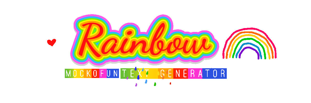
The fastest and most convenient method to add a rainbow text effect in your HTML is by using a simple graphic design app like MockoFun. This app offers premade template, and as it happens it has an easy to use and 100% free rainbow text generator.
You open it, input your text and download the end result as an image (JPG, WebP, PNG, etc). These images are perfectly fine to use in your HTML webpage instead of the making a pure CSS rainbow text.
This method is fast, but, not as flexible as CSS. If you need to change the text of adjust the effect, you will have to go back to the generator and make a new image. MockoFun supports animations though, and you can download animated GIFs.
Speaking of animations, let’s dig even deeper down the rainbow text CSS rabbit hole and see how we can animate these rainbow text effects.
BONUS: CSS Rainbow Text Animation
Animated Rainbow Gradient Text CSS
CSS animation is really simple. You just need to indicate when the animation starts and ends, and also which CSS property you want to animate. This is done using the @keyframes CSS directive. Check out the code below to see how I implemented the animated rainbow gradient text. Look at the animation that I named scroll. This animates the rainbow gradient background position on the y-axis.
Here’s the code and the resulting CSS rainbow text animation:
See the Pen Animated Rainbow Gradient Text CSS by Ion Emil Negoita (@inegoita) on CodePen.
CSS Animated Rainbow Text Shadow
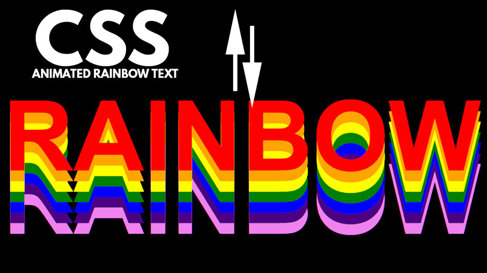
Starting with the CSS text shadow rainbow effect we’ve made earlier, let’s animate it. Because we were clever enough to use the CSS variable --shadow-space for the spacing between the rainbow shadows, we can easily make an accordion animation rainbow text effect.
Here’s the code and the end result:
See the Pen Untitled by Ion Emil Negoita (@inegoita) on CodePen.
CSS Rainbow Color Codes
Rainbow colors are a range of colors that span the visible spectrum of light, including red, orange, yellow, green, blue, indigo, and violet. These colors are often used together in web design to create a rainbow effect, which can add a playful or vibrant touch to a design.
In CSS, there are several ways to represent rainbow colors. One way is to use hex codes, which are six-digit codes that represent the red, green, and blue (RGB) values of a color. For example, the hex code for red is #ff0000, while the hex code for green is #00ff00. By combining different RGB values, designers can create a wide range of colors that can be used in a rainbow effect.
Another way to represent rainbow colors in CSS is to use color names, which are pre-defined names for a range of colors. For example, red, orange, yellow, green, blue, indigo, and violet are all color names that represent the colors of the rainbow. By specifying these color names in CSS, designers can easily create a rainbow effect without having to manually input RGB values.
In Conclusion
So, now you know several methods how to make a HTML rainbow text with CSS. There are so many uses for a rainbow color text in web pages especially because the rainbow is a symbol for many things.
If you use the methods from this post for creating your own CSS rainbow text effect, please share it via a comment as I’m always curious to see what my readers are doing with the info from CodingDude.