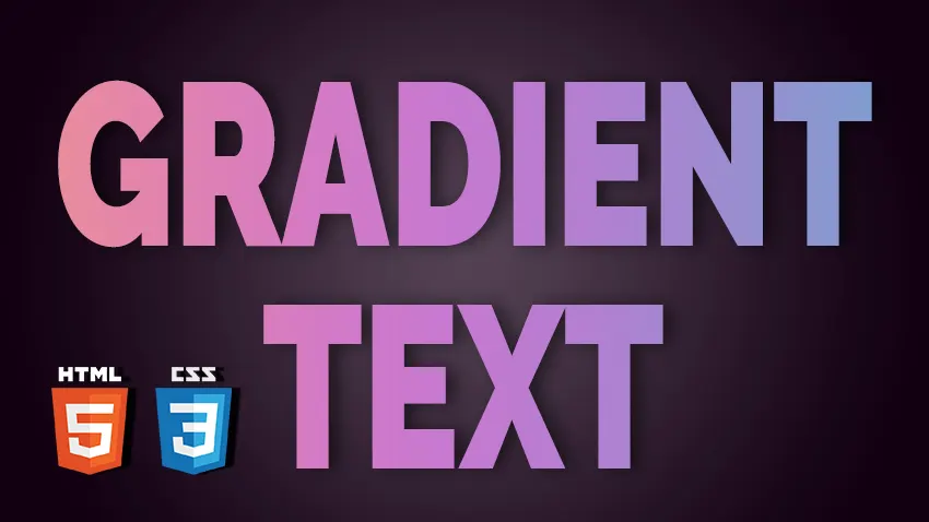
Creating Gradient Text with HTML and CSS
In some of my previous articles I’ve shown you how to create cool CSS image effects. Designers and developers are always looking for new and creative ways to make their websites stand out. One way to add some visual interest to your website is by using gradient text. Gradient text is simply text that has a gradient color effect applied to it, which gives it a unique and eye-catching appearance.
In this article, we will explore different methods for creating gradient text using HTML, CSS, SVG, and JavaScript.
Gradient Text with CSS
See the Pen Gradient Text 1 by Ion Emil Negoita (@inegoita) on CodePen.
CSS is a powerful tool for creating gradient text. The linear-gradient() function is used to create linear gradients, and the radial-gradient() function is used to create radial gradients. You can apply these functions to text by using the background-clip property.
Here’s an example of how to create a linear gradient for text using CSS:
.gradient-text {
   background-image: linear-gradient(to right, #833ab4, #fd1d1d,#fcb045);
  -webkit-background-clip: text;
  -webkit-text-fill-color: transparent;
}
In the above example, we apply the linear-gradient() function to the background-image property, and then set the background-clip property to text and the text-fill-color property to transparent. This tells the browser to apply the gradient to the text itself, and make the text color transparent so that the gradient shows through. CSS clipping is used for a number of applications like creating CSS circle image cropping. But let’s see what else we can do if we want to create text with gradient in CSS.
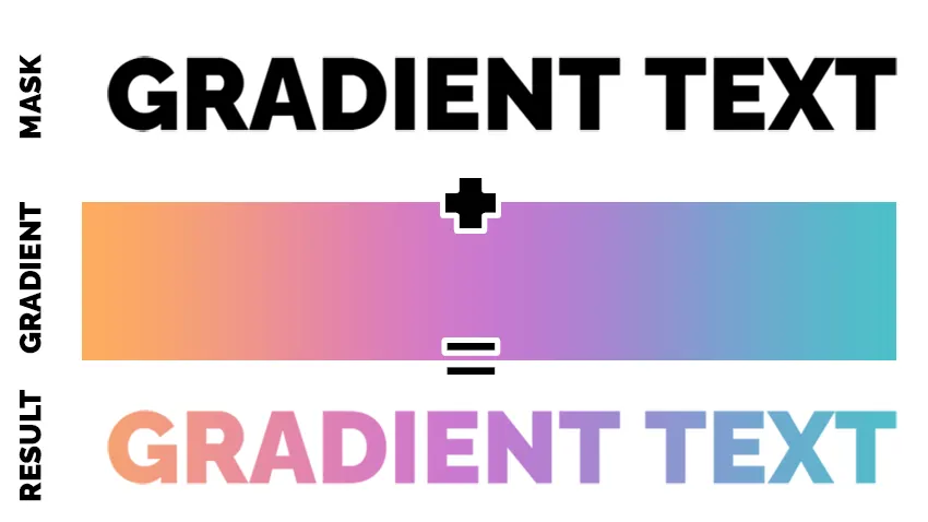
Another way to create gradient text with CSS is by using the mask-image property. This method works by using a PNG image with transparency as a mask image with a gradient, and then applying it to the mask.
.gradient-text {
 background-image: linear-gradient(to right, #FEAC5E, #C779D0,#4bc0c8);
-webkit-mask-image: url(https://i.imgur.com/JlYIFaP.png);
-webkit-mask-repeat:no-repeat;
-webkit-mask-position:center;
-webkit-mask:contain;
color:transparent;
}
See the Pen Gradient Text 2 by Ion Emil Negoita (@inegoita) on CodePen.
This method produces similar results to the previous one, but it needs an image containing your text. The advantage is that you can use this for other shapes, not only text.

Please note that there are online tools that offer a gradient text generator free and online and the results are really amazing. So, if it’s just an image with gradient text, you should try out a tool like that.
Using mix-blend-mode to Create Gradient Text
mix-blend-mode is a CSS property that enables you to specify how an element’s content should blend with the background. This can be especially useful when creating gradient text, as it allows you to blend the text color with a gradient background.
To use mix-blend-mode to create gradient text, you’ll first need to set the background color to a gradient using one of the methods discussed earlier in this article. Then, you can add the mix-blend-mode property to the text element and set it to a blending mode that works well with the background gradient.
Here’s an example of how to use mix-blend-mode to create gradient text:
HTML
<div class="gradient-background">
<h1 class="gradient-text">GRADIENT TEXT</h1>
</div>
CSS
.gradient-text{
  position:relative;
  color:red;
  mix-blend-mode:luminosity;
  background:white;
  color:gray;
}

.gradient-background{
    background-image: linear-gradient(to right, #FEAC5E, #C779D0,#4bc0c8);
}
See the Pen Gradient Text 3 by Ion Emil Negoita (@inegoita) on CodePen.
In this example, we’ve set the background to a linear gradient using the background property. We’ve then added a h1 element with the class gradient-text and set its mix-blend-mode property to luminosity. In the Luminosity blending mode, the luminance or brightness of the blend layer is used to determine the final color value of the pixel. The base layer’s color values remain the same. So, we set the color of the text to neutral gray and the background for the text element to white.
Benefits of Using mix-blend-mode
One of the biggest benefits of using mix-blend-mode to create gradient text is that it’s a pure CSS solution. There’s no need to use JavaScript or SVG, and you can achieve a gradient effect using just a few lines of CSS.
Another benefit is that mix-blend-mode allows for a lot of flexibility in terms of the types of gradients and colors that can be used. By choosing the right blending mode, you can achieve a range of effects from subtle to dramatic.
However, you should check for browser support.
Gradient Text with SVG
SVG (Scalable Vector Graphics) is an XML-based vector image format that is supported by all modern web browsers. SVG allows you to create complex shapes, patterns, and gradients, including gradient text.
To create gradient text with SVG, you can use the <text> element, which is used to define a piece of text. To add a gradient to the text, you can use the <linearGradient> or <radialGradient> element, which define a gradient that can be used to fill or stroke the text.
Here’s an example of gradient text with SVG:
<svg viewBox="0 0 400 50" xmlns="//www.w3.org/2000/svg">
 	<defs>
 	<linearGradient id="gradient" x1="0%" y1="0%" x2="100%" y2="0%">
 	<stop offset="0%" style="stop-color:rgb(255, 0, 0);stop-opacity:1" />
 	<stop offset="50%" style="stop-color:rgb(255, 255, 0);stop-opacity:1" />
 	<stop offset="100%" style="stop-color:rgb(0, 255, 0);stop-opacity:1" />
 	</linearGradient>
 	</defs>
 	<text x="50%" y="50%" text-anchor="middle" fill="url(#gradient)">Gradient Text</text>
</svg>
In this example, we’re creating a linear gradient (<linearGradient>) with three stops (<stop>), which define the colors and positions of the gradient. The id attribute is used to identify the gradient, which we can reference using the fill attribute of the <text> element. The text-anchor attribute is used to horizontally center the text, and the x and y attributes are used to vertically center the text.
You can also create radial gradients (<radialGradient>) by specifying the cx, cy, and r attributes, which define the center and radius of the gradient. Here’s an example of gradient text with a radial gradient:
<svg viewBox="0 0 400 50" xmlns="//www.w3.org/2000/svg">
 	<defs>
 	<radialGradient id="gradient" cx="50%" cy="50%" r="50%" fx="50%" fy="50%">
 	<stop offset="0%" style="stop-color:rgb(255, 0, 0);stop-opacity:1" />
 	<stop offset="50%" style="stop-color:rgb(255, 255, 0);stop-opacity:1" />
 	<stop offset="100%" style="stop-color:rgb(0, 255, 0);stop-opacity:1" />
 	</radialGradient>
 	 	</defs>
<text x="50%" y="50%" text-anchor="middle" fill="url(#gradient)">Gradient Text</text>
</svg>
In this example, we’re creating a radial gradient (<radialGradient>) with three stops (<stop>), which define the colors and positions of the gradient. The id attribute is used to identify the gradient, which we can reference using the fill attribute of the <text> element. The text-anchor attribute is used to horizontally center the text, and the x and y attributes are used to vertically center the text.
See the Pen Gradient Text 4 by Ion Emil Negoita (@inegoita) on CodePen.
SVG gradients can be combined with other SVG elements, such as shapes and images, to create more complex designs.
Gradient Text with JavaScript
In addition to using CSS and SVG, JavaScript can also be used to create gradient text. This method provides more control over the gradient and can create more complex effects.
Explanation of using JavaScript to create gradient text
To create gradient text with JavaScript, the basic idea is to create a canvas element and draw the gradient on it, then use the resulting image as a mask for the text. Here’s an overview of the steps involved:
- Create a canvas element and set its dimensions to match the text.
- Create a canvas context and use it to draw the gradient.
- Create a gradient and set it as the
fillStyleof the context - Write the text on the canvas.
- Convert the resulting canvas element to an image and use it as a background for the text element.
Example code for creating gradient text with JavaScript
See the Pen Gradient Text 5 by Ion Emil Negoita (@inegoita) on CodePen.
Here’s an example code snippet that demonstrates how to create gradient text with JavaScript:
var gradientTextElement = document.querySelector(".gradient-text");
// Get the canvas element and its context
var canvas = document.createElement('canvas');
canvas.width = gradientTextElement.offsetWidth;
canvas.height = gradientTextElement.offsetHeight;

var ctx = canvas.getContext('2d');
document.body.appendChild(canvas);


// Set the canvas dimensions to match the text
var text = "GRADIENT TEXT";
var fontSize = window.getComputedStyle(gradientTextElement, null).getPropertyValue('font-size');

var fontFamily = window.getComputedStyle(gradientTextElement, null).getPropertyValue('font-family');

var fontWeight = window.getComputedStyle(gradientTextElement, null).getPropertyValue('font-weight');

ctx.font = `${fontWeight} ${fontSize} ${fontFamily}`;
ctx.textAlign="center";
ctx.textBaseline="middle";

// Create the gradient
var gradient = ctx.createLinearGradient(0, 0, canvas.width, 0);
gradient.addColorStop(0, "#c5f9d7");
gradient.addColorStop(0.5, "#f7d486");
gradient.addColorStop(1, "#f27a7d");

// Use the gradient as a mask for the text
ctx.fillStyle = gradient;
ctx.fillText(text,canvas.width/2,canvas.height/2);

// Convert the canvas to an image and use it as a background for the text
var image = new Image();
image.src = canvas.toDataURL();
gradientTextElement.style.backgroundImage = "url('" + image.src + "')";
Benefits and drawbacks of using JavaScript for gradient text
Using JavaScript to create gradient text provides more control over the gradient and can create more complex effects than CSS or SVG. However, it also requires more code and can be slower than using CSS or SVG. Additionally, since canvas elements are not accessible to screen readers, this method may not be the best choice for creating accessible content. But, the solution above relies on an actual text element with the color set to transparent and the gradient text being set as a background image.
Overall, using JavaScript to create gradient text can be a powerful tool for creating unique and visually appealing designs.
Conclusion
In conclusion, adding gradient text to a webpage can add a unique and eye-catching design element to your site. Whether you choose to use CSS, SVG, JavaScript, or a combination of methods, gradient text can add depth and interest to your page. Additionally, using multiple colors and gradient overlays can enhance the visual appeal even further.
It’s important to keep in mind that while gradient text can be a powerful tool, it should be used strategically and in moderation. Too much gradient text can be overwhelming and detract from the overall design of the page.
With the examples and explanations provided in this article, you should be equipped to start experimenting with gradient text on your own website. Remember to consider the specific needs and goals of your website, and always test the design to ensure it is user-friendly and accessible.
By using gradient text effectively, you can take your website design to the next level and create a memorable user experience for your visitors.