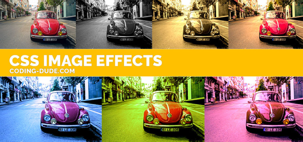
In this short CSS tutorial I will show you how to create some really cool and easy CSS image effects that you can apply to any online image. The image effects I will show you are the most common photo effects that photographers use when developing a photo.
I’m a photographer myself, so, I like to think that along my photography journey over the years I’ve learned a thing or two about image effects.
The CSS image effects I will demonstrate are:
- Old Paper Overlay
- Black and White
- Sepia
- Warm Colors
- Cold Colors
- Green Tint
- Magenta Tint
Though you can use tools like Photoshop, Lightroom or online tools like MockoFun and their awesome vintage photo editor to edit your photos, if you only need to place an image in a web page and apply a filter, here’s how to create cool CSS image effects.
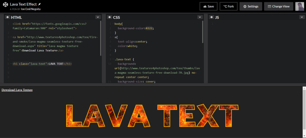
NOTE: One disadvantage of using images with CSS effects is that Google does not see the image with the applied effect. For the purpose of this tutorial, the images below are screenshots of the CSS image effects applied to the original image. They are NOT the live CSS effect. If you want to see or play around with the live effects please check this CodePen:
See the Pen Simple CSS Image Effects by Ion Emil Negoita (@inegoita) on CodePen.
CSS Image Effects using CSS filter
The filter CSS property is a very useful tool when you need to make image adjustments like adjusting the contrast, brightness, saturation etc of images in a web page.
Here’s a list of values that you can use with filter in CSS:
blurfor adding blur to imagesbrightnessfor making the image brighter or darkercontrastadjust the contrast of an imagedrop-shadowuse as an alternative tobox-shadowgrayscalefor transforming your image to gray scalehue-rotateadjust hue values for your photoinvertinverts the colors of the imageopacityalter the transparency of the imagesaturatealter the saturation values of your imagesepiaapply a sepia effect to the image
These CSS filters take in values (either percent or pixels in the case of blur for example). Also, you can apply combinations of these filters to the same image element (or any other HTML element for that matter).
So, let’s see the CSS filter property in action!
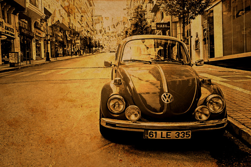
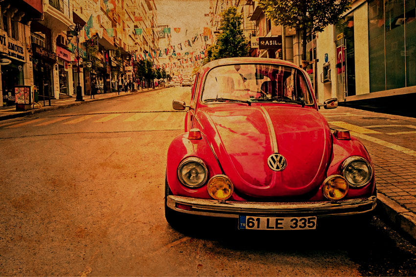
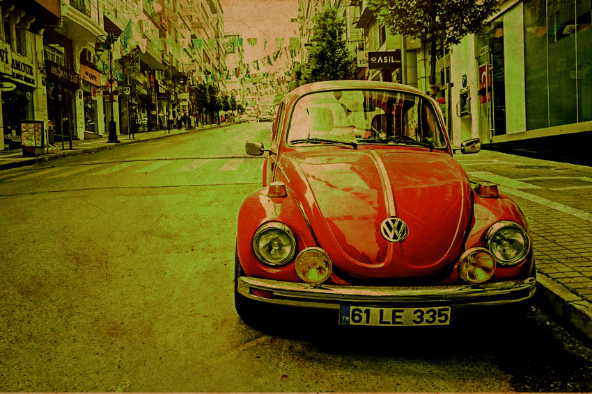
CSS Image Effects: Original Photo
Ok, so let’s take this image of an old Volkswagen Beetle I think
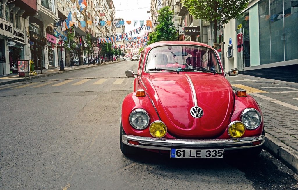
Let’s apply some cool CSS image effects on it using various values of the filter property.
To create a more vintage effect we’ll also use this old texture from Vintage Paper Textures free pack by PhotoshopSupply. You can also check out this old paper background collection of over 150 different vintage textures.

CSS Image Effects: Vintage Overlay
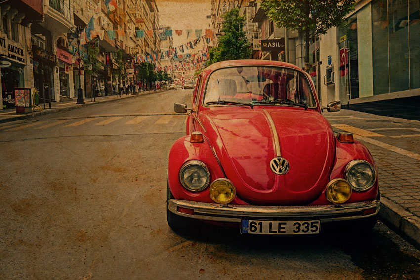
HTML Code:
<div class="old-paper">
<img class="original-image" src="https://i.imgur.com/ouDwClz.jpg" />
<div class="overlay">
<img src="https://i.imgur.com/4rKVgAQ.png">
</div>
</div>
CSS Code:
.old-paper{
  position:relative;
  max-width:850px;
}

.original-image{
  width:100%;
  height:100%;
  display:inline-block;
}
.overlay{
  mix-blend-mode:multiply;
  position:absolute;
  display:inline-block;
  left:0;
  top:0;
  right:0;
  bottom:0;
}

.overlay img{
  width:100%;
  height:100%;
}
For this vintage image effect I simply added the old paper texture over the original image and set the mix-blend-mode to multiply. If you are familiar with blending modes in Photoshop then this is pretty straight forwards to understand.
If not, the short explanation for blending modes is that they allow applying a math calculation on the colors between 2 images. You have to imagine each pixel color as a red, green, blue values from 0 to 1 (0,0,0 being black and 1,1,1 being white). In this case multiply will multiply the color components for each pixel and the result will be the color for the pixel displayed.
For the next CSS image effects I will use the same exact code, but in addition, I will apply different filters to the original image.
Let’s go on.
CSS Image Effects: Black and White
HTML Code:
<div class="old-paper">
    <img class="original-image black-and-white" src="https://i.imgur.com/ouDwClz.jpg" />
    <div class="overlay">
      <img src="https://i.imgur.com/4rKVgAQ.png">
    </div>
</div>
CSS Code:
.black-and-white{
  filter:brightness(70%) contrast(150%) saturate(0%) brightness(150%);
}
Adding the CSS class name .black-and-white to the original image adds the black and white effect. If we look into the CSS code we can see the sequence of filter values:
brightness(70%)dims the brightness of the image to 70% of the originalcontrast(150%)increases the contrast of the image by 50%saturate(0%)this totally de-saturates the colors of the original imagebrightness(150%)we bring up the brightness of the image by 50% of the result
Please keep in mind that the filter property values are applied in a sequence, meaning that the input for one filter is the output of the previous filter.
Let’s now see the settings for a sepia filter effect.
CSS Image Effects: Sepia
HTML Code:
<div class="old-paper">
    <img class="original-image sepia" src="https://i.imgur.com/ouDwClz.jpg" />
    <div class="overlay">
      <img src="https://i.imgur.com/4rKVgAQ.png">
    </div>
</div>
CSS Code:
.sepia{
  filter:filter:saturate(0%) sepia(100%) contrast(150%) saturate(150%);
}
There is a sepia filter built into CSS, but I find the result a bit boring, so I decided to do a few tweaks.
I de-saturate the image to make it black and white, apply the sepia filter, increase the contrast by 50% and then increase the saturation of the resulting image by 50%.
I’m pretty happy with the result. Please note, that for your images, the results might differ, so play with the settings until you get the result you want.
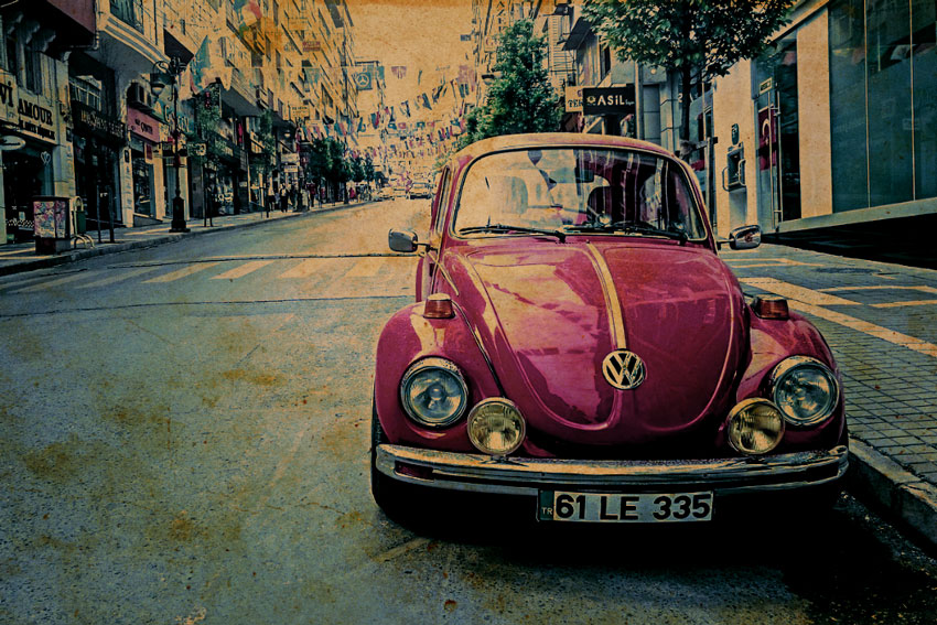
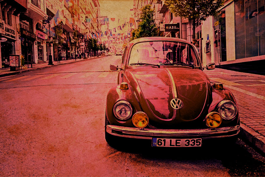
CSS Image Effects: Warm Colors
HTML Code:
<div class="old-paper">
    <img class="original-image warm" src="https://i.imgur.com/ouDwClz.jpg" />
    <div class="overlay">
      <img src="https://i.imgur.com/4rKVgAQ.png">
    </div>
</div>
CSS Code:
.sepia{
  filter: sepia(50%) contrast(150%) saturate(200%) brightness(100%) hue-rotate(-15deg);
}
The warm color image effect is used often by photographers to make photos more appealing. To make the image “warmer” we need to shift the colors towards red, orange and yellow.
This might take some experimentation, but what worked for me in this case was a combination of the sepia filter and the hue-rotate filter.
We’ve seen what the sepia filter does. How about hue-rotate?
hue-rotate shifts the hue of all the colors in the image. But why is the value in degrees?
Imagine the color wheel (actually, don’t imagine it, here it is)
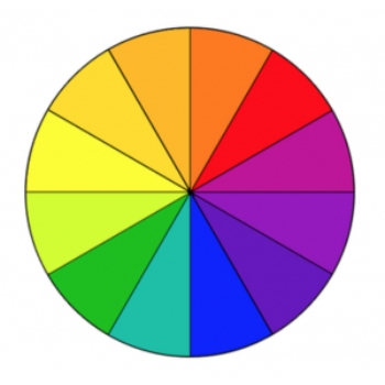
Using hue-rotate you can push one color by x degrees on the color wheel. 360 degrees will make a complete rotation, which will mean no change at all. The value for this property also works in the negatives and -90 for example is the equivalent of 270.
CSS Image Effects: Cold Colors
HTML Code:
<div class="old-paper">
    <img class="original-image cold" src="https://i.imgur.com/ouDwClz.jpg" />
    <div class="overlay">
      <img src="https://i.imgur.com/4rKVgAQ.png">
    </div>
</div>
CSS Code:
.cold{
  filter: hue-rotate(180deg) sepia(75%) contrast(150%) saturate(300%) hue-rotate(180deg);
}
Cold colors are more towards blue and cyan. The difference from our warm colors CSS effect is that sepia was already in the warm area. So, to overcome that problem, we first use the hue-rotate to do a 180 shift before we apply the sepia filter.
This will create a sepia effect (warm tones) with the colors replaced by their complementary colors (that’s what you call colors on opposite sides of the color wheel). So, doing a hue-rotate again by 180 at the end, will restore the colors to their original hue plus a reversed sepia effect which makes everything more blue, therefore colder.
I hope you got that!
If not, just drop me a comment below and I’ll get back to you.
Just a quick tip, using these photo effect on images is great. But, to make a really cool effect you can add some text on top of the image. You can do that in a photo editor, or you can even do it in online tools. For example, add your name on a photo with these name on image pre-made templates.
On with our image effects.
CSS Image Effects: Green Color Tint
HTML Code:
<div class="old-paper">
    <img class="original-image tint-green" src="https://i.imgur.com/ouDwClz.jpg" />
    <div class="overlay">
      <img src="https://i.imgur.com/4rKVgAQ.png">
    </div>
</div>
CSS Code:
.tint-green{
  filter: hue-rotate(-30deg) sepia(75%) contrast(150%) saturate(300%) hue-rotate(30deg);
}
In color theory a color tint refers to a color to which you add pure white. In photography, color tinting refers to adding a bit a certain colors to all colors in the photo.
For this tint image effect I used the same principle as for the warm/cold color effects to add a green tint to the original image.
After some experiments, I came up with the 30 degrees offset used in the hue-rotate filter, which has to do with the distance between the yellow hue of the sepia filter and the green tint we want to apply.
CSS Image Effects: Magenta Color Tint
HTML Code:
<div class="old-paper">
    <img class="original-image tint-magenta" src="https://i.imgur.com/ouDwClz.jpg" />
    <div class="overlay">
      <img src="https://i.imgur.com/4rKVgAQ.png">
    </div>
</div>
CSS Code:
.tint-magenta{
  filter: hue-rotate(-270deg) sepia(55%) contrast(150%) saturate(300%) hue-rotate(270deg);
}
Same idea as for the green color tint effect, but this time with a value of 270 degrees for the hue-rotate.
Credits
- Old Texture image provided by PhotoshopSupply.com
Maybe I am stupid, but there are jpgs that are already altered?
Like this: https://www.coding-dude.com/wp/wp-content/uploads/2020/05/css-image-effect-overlay-6.jpg
Or does the css alter these images permanently?
Hi Georg, you are not stupid, and it’s actually a very good question and I added a note in the article to explain what is going on. The images are screenshots of the final effect because Google will not index the final result of images with CSS effects, it will just see 7 times the original image. This is one of the disadvantages of using CSS effects. I’ve also included in the article a link to the CodePen where you can see the live effect: https://codepen.io/inegoita/pen/bGVXqam
[…] some of my previous articles I’ve shown you how to create cool CSS image effects. Designers and developers are always looking for new and creative ways to make their websites stand […]