So, How Do You Highlight Text In CSS and HTML?
In this short tutorial I will show you several cool ways in which you can use CSS to highlight text. Just like on paper, you highlight text in a HTML page to draw attention to important sections, paragraphs or group or words. On paper you might use a marker, highlighter or even a colored pen or pencil, but how do you highlight text in HTML using CSS?
How to Highlight Text In Pages: Standard <mark/> Highlight Tag In HTML
Yes, HTML offers a standard way to highlight text in pages using the <mark/> tag around the text you want to highlight.
The HTML Mark Tag (<mark>) represents text which is marked or highlighted for reference or notation purposes, due to the marked passage’s relevance or importance in the enclosing context.
Source: https://developer.mozilla.org/en-US/docs/Web/HTML/Element/mark
Let’s see an example!
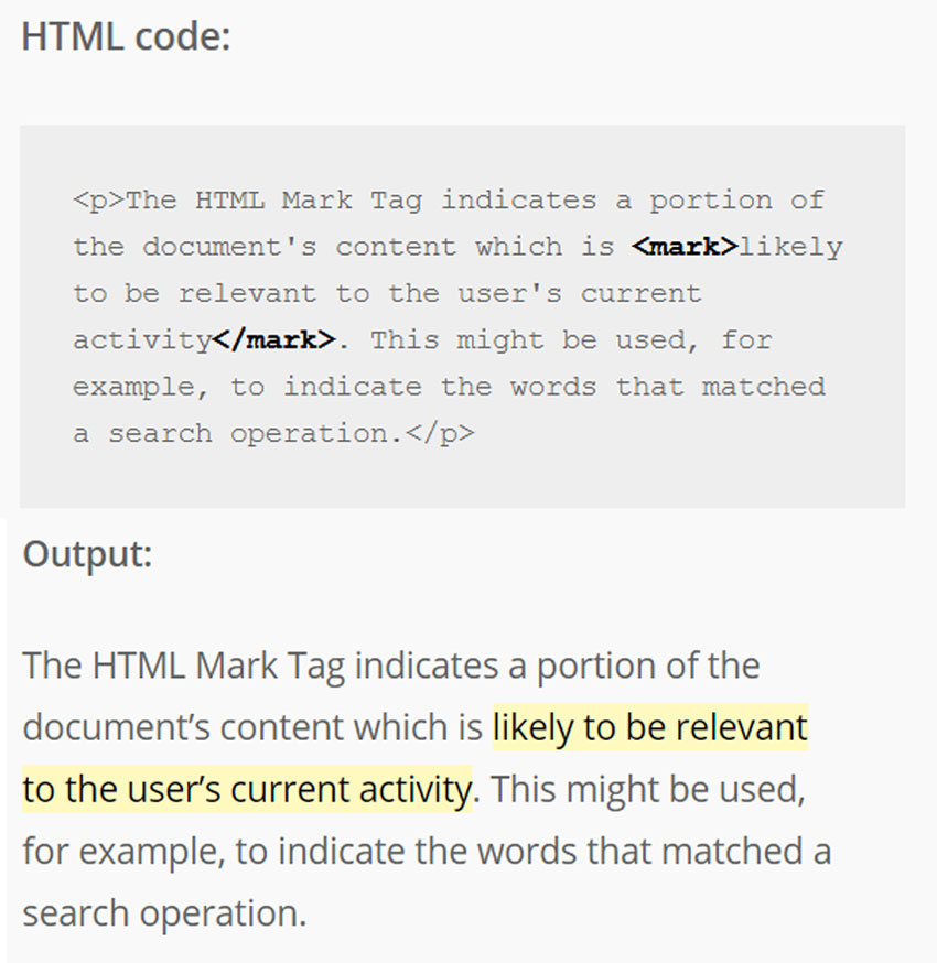
HTML code:
<p>The HTML Mark Tag indicates a portion of the document's content
which is <mark>likely to be relevant to the user's current activity</mark>.
This might be used, for example, to indicate the words that matched
a search operation.</p>
Which renders by default like this:
The HTML Mark Tag indicates a portion of the document’s content which is likely to be relevant to the user’s current activity. This might be used, for example, to indicate the words that matched a search operation.
You can easily change text highlight color with CSS like this:
mark{
 background-color:#c0ffc8;
}
which would change the highlight color to something like this.
Simple CSS Highlight Text Effect
Besides the <mark> standard HTML tag let’s highlight some text by wrapping it in a <span> tag and apply our own CSS highlight class. Let’s call the CSS highlight class .simple-highlight and we keep it simple, basically doing the same thing as the HTML <mark> tag.
HTML Code:
<p>The <span class="simple-highlight">most common color for
highlighters is yellow</span>, but they are also found in orange,
red, pink, purple, blue, and green varieties.</p>
CSS Code:
.simple-highlight{
 background-color:yellow;
 padding:0.1em 0.2em;
}
and the result looks like this:
The most common color for highlighters is yellow, but they are also found in orange, red, pink, purple, blue, and green varieties.
I added a small padding, because I like the highlighted text to have a bit more “air to breathe”.
And now for the fun part:
Let’s see some how to create a few different cool CSS highlight text effects!
Ribbon CSS Highlight Text Effect
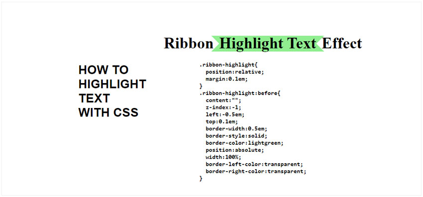
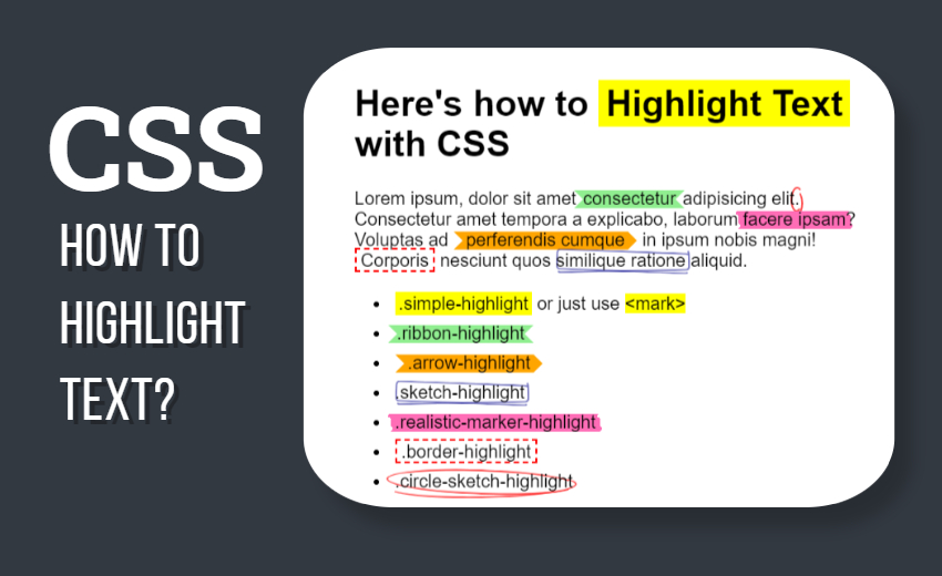
The ribbon highlight text effect highlights the text using a :before CSS pseudo element added underneath the text we want to highlight. The ends of the highlight box look like ribbon ends, so I named this CSS highlight text effect Ribbon Highlight.
Let’s see the HTML code:
<p>Ribbon <span class="ribbon-highlight">Highlight Text</span> Effect</p>
CSS Code:
.ribbon-highlight{
  position:relative;
  margin:0.1em;
}
.ribbon-highlight:before{
  content:"";
  z-index:-1;
  left:-0.5em;
  top:0.1em;
  border-width:0.5em;
  border-style:solid;
  border-color:lightgreen;
  position:absolute;
  width:100%;
  border-left-color:transparent;
  border-right-color:transparent;
}
No need for much explanations here. You can change the text highlight color by changing the border-color property in the CSS.
The ribbon effect is achieved by using a CSS trick that involves the use of border for creating triangles. If you want to learn more about that, check out my awesome CSS Triangle tutorial.
Arrow CSS Highlight Text Effect
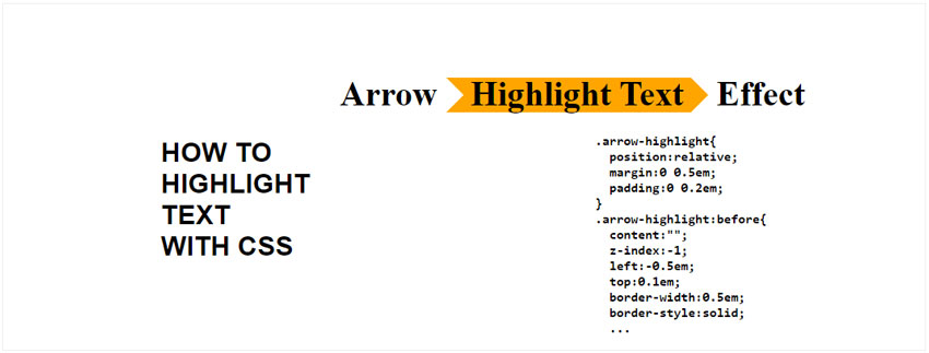
HTML Code:
<p>Arrow <span class="arrow-highlight">Highlight Text</span> Effect</p>
CSS Code:
.arrow-highlight{
  position:relative;
  margin:0 0.5em;
  padding:0 0.2em;
}
.arrow-highlight:before{
  content:"";
  z-index:-1;
  left:-0.5em;
  top:0.1em;
  border-width:0.5em;
  border-style:solid;
  border-color:orange;
  position:absolute;
  width:calc(100% - 0.5em);
  border-left-color:transparent;
}

.arrow-highlight:after{
  content:"";
  z-index:-1;
  right:0;
  top:0.1em;
  border-width:0.5em;
  border-style:solid;
  border-color:orange;
  position:absolute;
  border-top-color:transparent;
  border-bottom-color:transparent;
  border-left-color:transparent;
  transform:rotate(180deg);
  transform-origin:center right;
}
The arrow CSS highlight text effect is a variation on the ribbon highlight effect. Using an extra pseudo element :after I am adding the tip of the arrow also using the CSS triangle trick as above. Again, you can easily change the color of the text highlight effect by changing the border-color.
Border CSS Highlight Text Effect
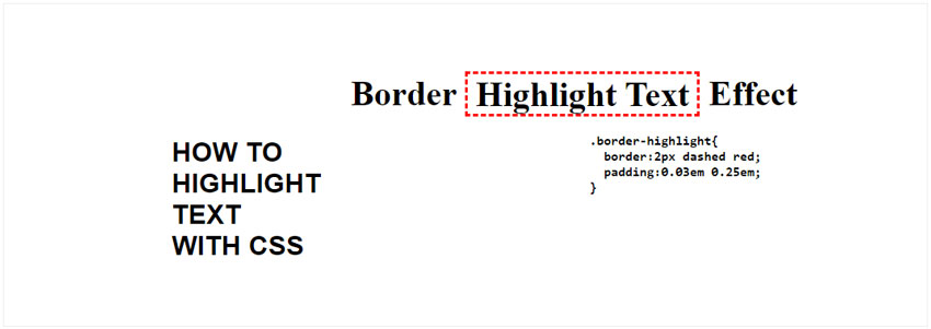
HTML Code:
<p>Border <span class="border-highlight">Highlight Text</span> Effect</p>
CSS Code:
.border-highlight{
  border:2px dashed red;
  padding:0.03em 0.25em;
}
This simple dashed border highlight effect is very easy to implement, but it looks really nice.
Sketch CSS Highlight Text Effect
HTML Code:
<p>Sketch <span class="sketch-highlight">Highlight Text</span> Effect</p>
CSS Code:
.sketch-highlight{
  position:relative;
}

.sketch-highlight:before{
  content:"";
  z-index:-1;
  left:0em;
  top:0em;
  border-width:2px;
  border-style:solid;
  border-color:darkblue;
  position:absolute;
  border-right-color:transparent;
  width:100%;
  height:1em;
  transform:rotate(2deg);
  opacity:0.5;
  border-radius:0.25em;
}

.sketch-highlight:after{
  content:"";
  z-index:-1;
  left:0em;
  top:0em;
  border-width:2px;
  border-style:solid;
  border-color:darkblue;
  border-left-color:transparent;
  border-top-color:transparent;
  position:absolute;
  width:100%;
  height:1em;
  transform:rotate(-1deg);
  opacity:0.5;
  border-radius:0.25em;
}
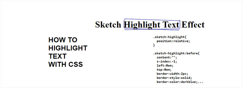
For this text highlight effect I tried to create a highlight style that looks like doodle sketches made around the highlighted words with a blue ballpoint pen. I think it looks pretty good, just like handwriting.
The effect is made up of two pseudo elements :before and :after, using border-radius to make rounded borders and a rotate transform with a small value to add that handwriting doodle sketch effect to the CSS text highlight.
The text highlight color is darkblue to mimic the ballpoint pen and I also reduced the opacity a bit. You can play around with the settings and get your own sketch CSS highlight text effect.
Circle Sketch CSS Highlight Text Effect
HTML Code:
<p>Circle sketch <span class="circle-sketch-highlight">Highlight Text</span> Effect</p>
CSS Code:
.circle-sketch-highlight{
  position:relative;
}

.circle-sketch-highlight:before{
  content:"";
  z-index:-1;
  left:-0.5em;
  top:-0.1em;
  border-width:2px;
  border-style:solid;
  border-color:red;
  position:absolute;
  border-right-color:transparent;
  width:100%;
  height:1em;
  transform:rotate(2deg);
  opacity:0.7;
  border-radius:50%;
  padding:0.1em 0.25em;
}

.circle-sketch-highlight:after{
  content:"";
  z-index:-1;
  left:-0.5em;
  top:0.1em;
  padding:0.1em 0.25em;
  border-width:2px;
  border-style:solid;
  border-color:red;
  border-left-color:transparent;
  border-top-color:transparent;
  position:absolute;
  width:100%;
  height:1em;
  transform:rotate(-1deg);
  opacity:0.7;
  border-radius:50%;
}
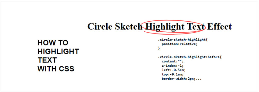
This highlight effect is similar to the sketch effect with the difference that this looks like the highlighted words are circled using a red ballpoint pen. You can change the color of the highlight text effect by changing the border-color.
Realistic Marker CSS Highlight Text Effect
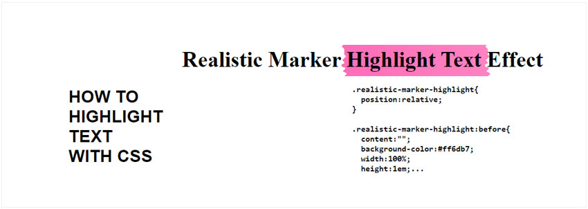
For this highlight effect I am using an extra trick: a SVG filter. I need this to give the wavy edges of the highlight box around the text.
HTML Code:
<p>Realistic Marker <span class="realistic-marker-highlight">Highlight Text</span> Effect</p>
CSS Code:
.realistic-marker-highlight{
  position:relative;
}

.realistic-marker-highlight:before{
  content:"";
  background-color:#ff6db7;
  width:100%;
  height:1em;
  position:absolute;
  z-index:-1;
  filter:url(#marker-shape);
  left:-0.25em;
  top:0.1em;
  padding:0 0.25em;
}
And the SVG Filter Code:
<svg xmlns="//www.w3.org/2000/svg" version="1.1" class="svg-filters" style="display:none;">
  <defs>
    <filter id="marker-shape">
      <feTurbulence type="fractalNoise" baseFrequency="0 0.15" numOctaves="1" result="warp" />
      <feDisplacementMap xChannelSelector="R" yChannelSelector="G" scale="30" in="SourceGraphic" in2="warp" />
    </filter>
  </defs>
</svg>
The SVG code can be safely added right inside the HTML code of the page where you want to use this realistic marker CSS highlight text effect.
Notice that the SVG filter has the ID marker-shape and that I’m referencing this filter by ID in the CSS code filter:url(#marker-shape);. Without going too much in detail, the SVG filter acts like a displacement map or a distortion effect on the highlight box. I’ve used a similar effect on my online wavy text generator.
I think that SVG filters are a very powerful tool, but sometimes complicated to use. If you would like to learn more about what you can do with them check out my 80s fonts SVG filters.
How to Highlight Text in Other Tools
Besides highlighting text in HTML and CSS, there are other tools or software where you might want to highlight portions of text.
Let’s quickly see a couple of examples and solutions for those situations:
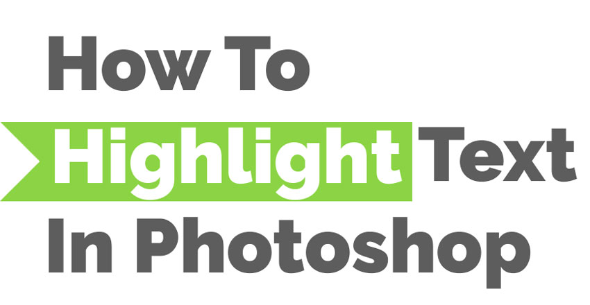
How to highlight text in Photoshop?
To be honest, creating the highlight text effect in Photoshop is not as easy as you might think. Going into a tutorial on how to highlight text in Photoshop is beyond the scope of this article, but I will tell you how I do it.
I use this free Photoshop action to Highlight Text in Photoshop. You download it, install it and with one click you can highlight text in Photoshop with several different effects. The action is made by PhotoshopSupply.com, a site with lots of Photoshop freebies.
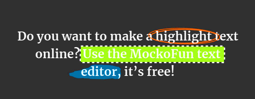
How to highlight text online?
Yes, you can even highlight text online. For this I use the MockoFun text highlighter online. In my opinion this option is far superior to using Photoshop or any other graphic design tool.
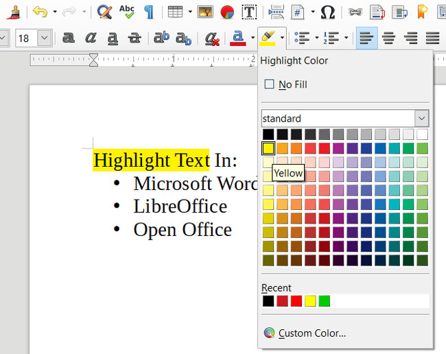
How to highlight text in Word, LibreOffice or Open Office?
Simply select the text you want to highlight and use the Highlight Tool. Select a color and you’re DONE!
In Conclusion
If you want to highlight text in HTML pages, now you have several highlight text styles and effects that you can use just by copy/pasting the CSS code to your page. Let me know if you liked any of the text highlight methods by leaving a comment below.


Good article John, and a great round-up of styles. Just to add a caveat to this: If highlighting more than one word that becomes broken across lines – as doubtless it on various devices – the styling will not function correctly. To fix this I added the HTML tag in between the spaces between the words. It’s a bit of a hack, but it works 😉
🙂 thanks! I’m glad you like it, and yes you are right, there are some cases like word-breaking in which you might not get the expected result. Well, if you found a work around and it works, you know how they say “if it works, it works!”
Hi John!
Thank you for this great tutorial!
I tried to add a “Realistic Marker CSS Highlight Text Effect”. Everythink seems to work, but I don’t get the visual effect of the edges. I get only the “normal” marking effect with the color.
Maybe there is so settings, which need to be changed? I tryed it als here with your code: https://codepen.io/alvarotrigo/pen/mdpbjPm
But also here is the effect, only a “line”
Could you check the settings you provided above in the HTML Code for svg?