Probably the easiest way to add a triangle in a web page is to simply draw it in an image and add the image to the web page. There are many secrets to drawing the perfect triangle and you can read how to do that in Photoshop in this article: Create A Triangle in Photoshop or download this free pack of triangle shapes for Photoshop.
In this post I will show you how to create a triangle with CSS & HTML.
Here’s an overview of the different methods I will use:
- Create a triangle using CSS
border - Create a triangle with CSS gradients (
linear-gradientandconical-gradient) - Create a triangle using
overflowandtransform - Create a triangle using
clip-path
Using border to Create a Triangle in CSS
If you’ve searched the internet for how to make a CSS triangle, you’ve probably seen this awesome article from CSS tricks. They quickly explain how to create a triangle using the CSS border property.
Let me quickly explain!
Consider the following HTML code:
<div class="triangle"></div>
And the CSS:
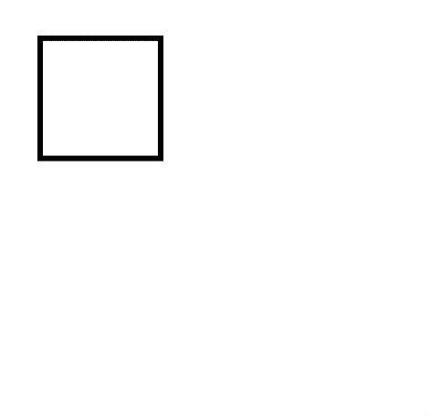
.triangle {
    border-left: 20px solid cyan;
    border-right: 20px solid red;
    border-bottom: 20px solid green;
    border-top: 20px solid blue;
    display: inline-block;
}
which will render like this:

This is because the borders of an HTML element form an angle where they join. We can make use of this to create a triangle by setting a transparent color for 3 of the borders and leaving only one visible. So, the bottom border will create a triangle pointing up, the left border will create a triangle pointing right and so on.
Here’s the CSS code for creating a green triangle pointing up:
.triangle-up {
    border-left: 20px solid transparent;
    border-right: 20px solid transparent;
    border-bottom: 20px solid green;
    border-top: 20px solid transparent;
    display: inline-block;
}
which renders like this:

And now, a bit of math.
As you can see, this triangle is a right triangle. So, the upper angle is 90 degrees. It’s also an isosceles triangle because it has two equal sides. When setting the same size for all the borders, we are actually setting the height of the triangle.
So, 20 pixels in our case.
Because our triangle is a right triangle and isosceles, we can determine that the base of the triangle is 40 pixels (half of the border size we used). Then each sides is equal to basis / sqrt(2) so approximately 28.2 pixels.
Triangles are very useful design elements for all sort of applications. Group more triangles and you get a star! Check out my CSS star shape tutorial to see how you can create and use stars in your web design.
How To Make An Equilateral Triangle Using border
What if we want the triangle to be equilateral? So, all three sides of the triangle to be equal?
Let’s do some math!
In the previous example, we’ve seen that the border size actually decides the height of the triangle. The formula for the height of the equilateral triangle is:
height = side * sqrt(3) / 2
We also need to keep in mind, that our basis is twice the size of the border we chose.
So, for a border-width set to 20px for the transparent borders, we need to set the border size to 2 * 20px * sqrt(3) / 2
We can approximate sqrt(3)/2 to roughly 0.866 so here’s the CSS equilateral triangle:
.triangle-up-equilateral {
    border-left: 20px solid transparent;
    border-right: 20px solid transparent;
    border-bottom: calc(2 * 20px * 0.866) solid green;
    border-top: 20px solid transparent;
    display: inline-block;
}
which renders like this:

Alternatively, there’s a neater way to write the CSS class for this:
.triangle-up-equilateral {
    --side-size: 20px;
    border-left: var(--side-size) solid transparent;
    border-right: var(--side-size) solid transparent;
    border-bottom: calc(2 * var(--side-size) * 0.866) solid green;
    border-top: var(--side-size) solid transparent;
    display: inline-block;
}
Using a CSS variable allows us to set the size of the equilateral triangle in only one place.
How To Create a Triangle Using CSS Gradients
Another way to draw a triangle using CSS only is by using gradients.
.triangle {
    width: 200px;
    height: 200px;
    background: linear-gradient(to bottom right, #fff 0%, #fff 50%, green 50%, green 100%);
}
Which renders as a right triangle:

This basically creates a gradient fill coming from top left to bottom right and a hard stop right in the middle (50%).
We can also make use of the less known CSS gradient type conic-gradient like this:
Another way to draw a triangle using CSS only is by using gradients.
.triangle-element {
    width: 40px;
    height: 40px;
    background: conic-gradient(at 50% 50%,transparent 135deg,green 0,green 225deg, transparent 0);
}
Which renders a similar right isosceles triangle as above:

This creates a triangle of height 20 pixels and gives us a a bit more control over the angle pointing up. As you see we instruct the gradient to fill the div between 135 degrees and 225 degrees (making a right angle). In a similar way we can create arrows pointing down, left or right just by changing the range of the angles.
For some reason, this seems to create a bit of a rough edge. If you guys know of a way to improve this please let me know.
I’ve been using triangles with various orientations to create CSS speech bubbles, read more to see how.
How To Create a Triangle Using CSS transform and overflow
If we want, we can create a triangle by adding a pseudo element to a square div, rotate it by 45 degrees and using overflow:hidden to hide the parts of the resulting triangle that fall outside our div square.
Here’s the CSS:
.triangle-element {
    width: 20px;
    height: 20px;
    overflow: hidden;
    position: relative;
    margin: 10px;
}
.triangle-element:after {
    content: '';
    background: green;
    width: 142%;
    height: 142%;
    position: absolute;
    transform: rotate(45deg) translate(-71%,0);
}
Which will render as:

How To Create A Triangle In CSS Using clip-path
And here’s another way to make a CSS triangle. We can use the clip-path property. This property works like a clipping mask in Photoshop. Basically you can show only parts of an HTML element.
clip-path accepts a number of value types from reference to SVG files to an inline polygon definition. When talking about SVG clip paths I do recommend reading Sara Soueidan’s blog as she is a true master in that area imho.
Let’s see how that works to create a triangle:
Here’s the CSS:
.triangle-element {
    width: 40px;
    height: 40px;
    background: green;
    clip-path: polygon(50% 0%, 0% 100%, 100% 100%);
}
That’s is?!?!
Yes, that is IT. We create the triangle by defining it as a polygon with 3 corners. This code will create an isosceles triangle with a basis of 40 pixels and a height of 40 pixels, but you can easily imagine how to change it.
I think this is by far the method that allows the most control.
Once you’ve mastered basic CSS shapes like triangles, you might want to explore more complex geometry. For more intricate paths that are difficult to code manually, a spiral maker is a great way to generate the necessary coordinates or SVG code.
Conclusion
There are a lot of uses for triangles. From arrows to map pins, from menu markers to chart elements.
Now you know how to create a triangle with CSS.
If you liked this tutorial, make sure to check out our Complete How-To Guide for creating and using CSS Circle Images or see how to create a CSS only bar chart in HTML.
[…] 5 Ways To Create A Triangle With CSS […]