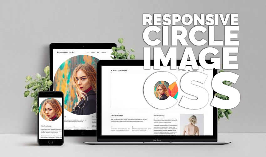
The circle image CSS problem: Images come in rectangle or square shape.
You can always use a photo editor like Gimp or Photoshop to crop an image into a circle (if that’s what you want check out this automated action from PhotoshopSupply to Crop An Image Into Any Shape) or even use online tools like MockoFun to Crop Picture Into Circle Online. But this post is about how to make circular images using CSS.
So, how do you make a circle image with CSS only?
In this post I will show you how to use CSS to transform a rectangular or square image into a circular image.

CSS Rounded Image Using border-radius
The simplest solution to making a CSS circle image is to use border-radius. This is used to make rounded borders for HTML elements, so it also works for images.
For this method to work on images of all size ratios (landscape, portrait or square) it’s necessary for the image to have a parent HTML element aka a wrapper. We will use a span element as the wrapper with circle-image CSS class name.
Here’s the HTML code:
<span class="circle-image">
 <img src="your-image.jpg"/>
</span>
And the CSS for making the circular image:
.circle-image{
  display: inline-block;
  border-radius: 50%;
  overflow: hidden;
  width: 50px;
  height: 50px;
}
.circle-image img{
  width:100%;
  height:100%;
  object-fit: cover;
}
That’s all the CSS code you need to display a HTML circle image!
I used display:inline-block because span is by default inline and I need something that I can set sizes for.
Setting the border-radius to 50% is actually what creates our CSS rounded image, because it rounds the corners with a radius of 50% (half) of the whole size of the image.
For the img I just used 100% for the size to make sure that it fits snugly inside the wrapping element.
The object-fit:cover makes sure that the image ratio is maintained, so it’s not stretched.
This approach is quite simple, but it’s not without inconveniences. For example, you have to input the size for the image. I put in 50px, but you will have to put in the size you need.
CSS Circle Image Using background-image
Basically, we use CSS to set our image on the background of a HTML element and we make the element round.
This will display our circle image. Here’s the HTML code:
Here’s the HTML code:
<div class="circle-image"></div>
and our circle image CSS code:
.circle-image{
  width: 50px;
  height: 50px;
  background-image: url('your-image.jpg');
  background-size: cover;
  display: block;
  border-radius:50%;
}
Done!
If you need to position the image differently inside the circle, you can use the background-position CSS property to specify the left and top position, or the combinations of bottom|top|center|left|right.
In most cases these solutions will be enough, but what if you need to make a responsive circle image with CSS?

Responsive Circle Image CSS
Whether we like it or not, responsive web design is an important requirement for websites. Let’s see what we need to change in our circle image CSS code above to make a responsive circular image.
The HTML code stays the same, because we still need the wrapping element:
<span class="circle-image">
 <img src="your-image.jpg"/>
</span>
And the responsive circular image CSS code:
.circle-image{
    display: inline-block;
    overflow: hidden;
    width: 33%;
    padding-bottom: 33%;
    height: 0;
    position: relative;
}
.circle-image img{
  width:100%;
  height:100%;
  position: absolute;
  border-radius: 50%;
  object-fit: cover;
}
So, what did we change?
Well, first of all we have the width of the span wrapping element set with a percent. This makes the circle image responsive. I used 33%, so it will be scaled to 1 third of the image container.
I know that there’s much more to CSS responsive images, like media queries for example, but that’s way out of the scope of this post.
Here’s a neat trick:
setting height to 0 and padding-bottom to the same as the width is a CSS trick to make the span shape into a square. We need this to make sure that the image becomes a circle and not a squeezed ellipse.
I did not come up with this, I found this trick about how to make an HTML element a square with CSS here.
One last thing we set for the wrapping element is the position:relative. This is because the image inside will have position:absolute and we want the image to position absolute related to the wrapping element, and not to the whole document.
Finally, we have border-radius again set to 50%, but this time on the image. This will make the image into a circle.
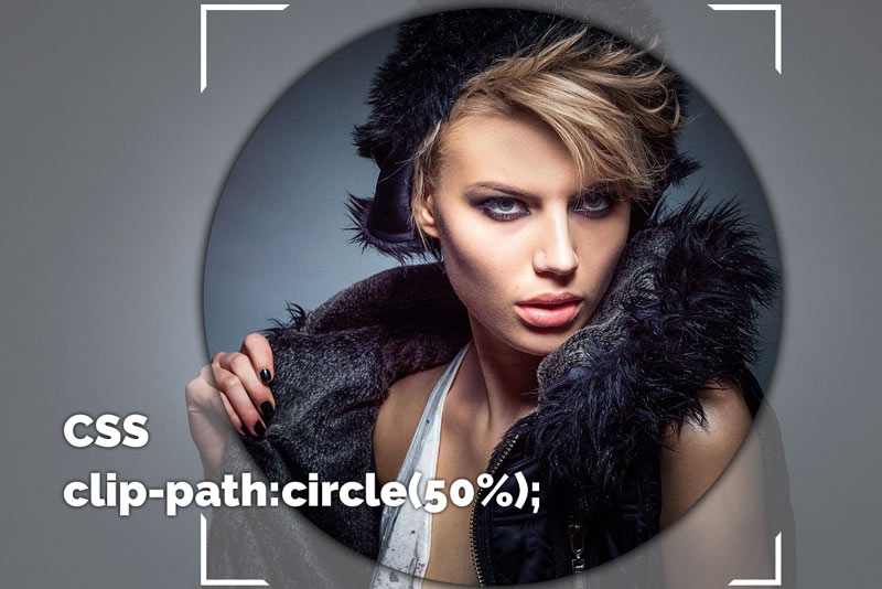
Make a Circle Image with CSS clip-path
Now, let’s see another method to use CSS for circle images.
The clip-path CSS property creates a clipping region that sets what part of an element should be shown. Parts that are inside the region are shown, while those outside are hidden. One of the values for this CSS property is circle.
Here’s the syntax:
clip-path: circle( [ <radius> ]? [ at <position> ]? )
So, with this CSS property you can clip an image element in the shape of a circle with a specified radius and with a specified center.
The HTML code stays the same:
<span class="circle-image">
 <img src="your-image.jpg"/>
</span>
And in the responsive circular image CSS code we only replace border-radius with clip-path:
.circle-image{
    display: inline-block;
    overflow: hidden;
    width: 33%;
    padding-bottom: 33%;
    height: 0;
    position: relative;
}
.circle-image img{
  width:100%;
  height:100%;
  position: absolute;
  clip-path: circle(50%);
  object-fit: cover;
}
Adding the clip-path property crops the image into a circle with a radius that is half of the wrapping element. If you need to
Just a quick tip before you go: to make a really cool effect you can add some text on top of the circle image. You can do that in a photo editor, or you can even do it in online tools. For example, add your name on a circle photo with these name on image pre-made templates.
In Conclusion
You have a lot of options form making a CSS circle image, and now you know them all with pros and cons. If you have any questions or remarks please drop me a comment below and I will try to help.
If you enjoyed this post and are looking to learn HTML and CSS I recommend you next read my post Create Beautiful HTML Bar Charts.

[…] CSS Circle Image: “How To” Complete Guide […]
The training you gave was complete and perfect, thank you