Here’s the deal:
Plain text is dull. Sure, you can make a text more interesting by changing the text color or choosing a fancy font face (for example, check out this list on MockoFun with +50 free Christmas fonts that you can use online).
But, what if you want more?
You can easily make text with texture using only a few CSS lines. In this post I will show you how to use any image as a texture for your text and create a several awesome typographic text effects. You can use the code with your own images and get the text effects you need. And it works with any font.
Quick tip: Before we get started, did you know there are online text generators that can create text with texture on the fly? Check out Textturizer – an online text generator that you can use to combine text with texture in thousands of combinations.
Let’s get started!
How can I put an image texture on text in HTML?
This is the ultimate guide to adding texture on text in an HTML page.
In one of my old post I shared the glossy button CSS code, but that was very basic CSS coding. In this tutorial I will show you some more advanced CSS and JavaScript techniques to create visual effects.
So, you have an HTML page with a big nice title. You could make it nicer by putting a texture or pattern on top of text in HTML.
How do you do that?
This post I will show a few CSS tricks that will allow you to get nice textured text effects with minimal effort.
If you’re looking for ways to add text on an image, you can add your name on a photo with these name on image pre-made templates.
For this we will use a couple of seamless and non-seamless image textures that you can download for free:
I will transform these into CSS textures.
Let’s get started.
Method 1 – Using the CSS background-clip property
There’s no CSS property for an HTML text element where you can indicate placing a texture on text.
Then, how do we apply an image to the text?
We’ll actually need a background layer where the image is set as the background and a foreground layer where the text sits. Then, using CSS we instruct the browser to clip a portion of the background using the shape of the text in front.
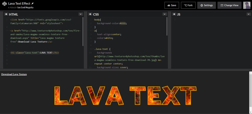
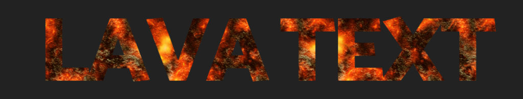
Create an HTML file and add:
<h1 class="lava-text">LAVA TEXT</h1>Also, create a CSS file, include it in your HTML file and add the following code:
.lava-text {
 background: url(//www.textures4photoshop.com/tex/thumbs/lava-magma-seamless-texture-free-download-70.jpg) no-repeat center center;
 background-size: cover;
 color: #fff;
 -webkit-text-fill-color: transparent;
 -webkit-background-clip: text;
 -moz-background-clip:text;
 background-clip:text;
 font-family:Catamaran,sans-serif;
 font-size:10em;
 padding:0;
 margin:0;
 text-align:center;
 -webkit-text-stroke: 3px #ffaa00;
}
And here’s the result:

See the Pen Lava Text Effect by Ion Emil Negoita (@inegoita) on CodePen.
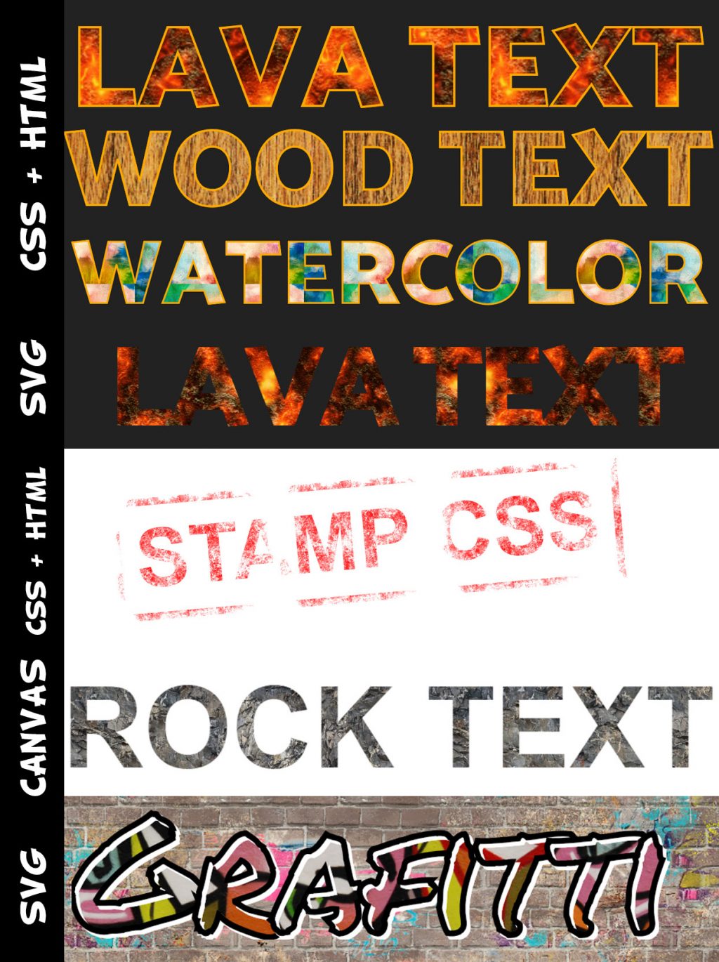
Want to use a different texture? Simply change the background property to your image.
Here’s the result using the wood texture:
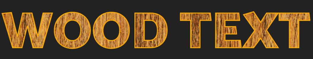
Download wood textures for free and try different types of wood texture with this text.
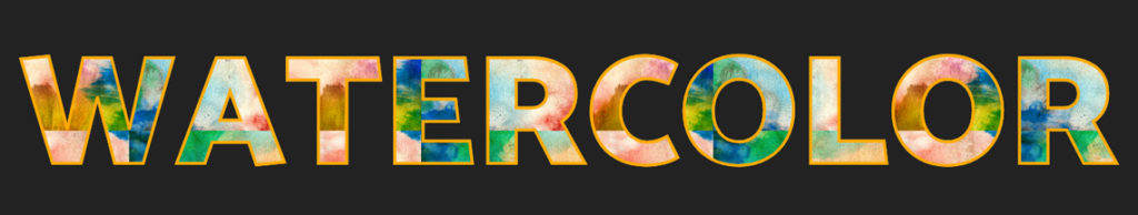
And with some minor CSS modifications and the watercolor texture:
background: url(//www.textures4photoshop.com/tex/thumbs/watercolor-paint-background-free-thumb32.jpg) repeat center center;background-size: 20%;
Method 2 – Using svg clippath to add texture to text
SVG can be very useful sometimes for creating text effects. Let’s see how we can add the textures to a text.
We will put in the background image as a simple img element and add a SVG text element inside a clippath element. clipath elements allow using SVG elements as kind of a mask.
Here’s the HTML code:
<img class="svg-clip" src="//www.textures4photoshop.com/tex/thumbs/lava-magma-seamless-texture-free-download-70.jpg"/><svg height="0" width="0"><defs><clippath id="svgPath"><text x="0" y="200" textLength="800" lengthAdjust="spacing" font-family="Catamaran" font-size="10em"> LAVA TEXT </text></clippath></defs></svg>
and the CSS code that instructs the image to use the SVG text as a mask:
.svg-clip {-webkit-clip-path: url(#svgPath);clip-path: url(#svgPath);margin:0 auto;}
This is the end result
See the Pen Lava Text Effect Using SVG by Ion Emil Negoita (@inegoita) on CodePen.
One advantage of this method is that you can use any vector shape as a mask for the texture, not only text.
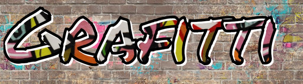
Method 3 – Using svg fill to add a pattern to text
This method is similar to the previous method using svg.
The difference is that instead of clippath we will now use a fill image for our text. For this we will need to define a pattern element and an image inside.
Here’s the code:
<svg width="100%" height="100%"><pattern id="pattern" patternUnits="userSpaceOnUse" width="100%" height="100%"><image xlink:href="//www.textures4photoshop.com/tex/thumbs/graffiti-wall-texture-free-1-thumb28.jpg"></image></pattern><text x="0" y="0.8em" width="100%" textlength="650" class="headline" style="fill:url(#pattern);">Grafitti</text></svg>
That’s it. You can change the font used by specifying it in the CSS. Here’s the end result and the full code:
See the Pen Grafitti Textured Text Using SVG fill by Ion Emil Negoita (@inegoita) on CodePen.
Method 4 – Using mask-image with a PNG texture to create a stamp text effect
For this method you will need a texture with transparency. So, something like this grunge PNG grunge texture will work just fine.
The HTML code for this method of applying texture to a text is similar with the other methods:
<div><h1 class="stamp-text">STAMP CSS</h1></div>
But the CSS is slightly different as we will make use of the mask-image CSS property:
h1{font-size:7em;color:red;display:inline-block;font-family:sans-serif;padding:10px 20px;margin:40px;transform:rotate(-5deg);}.stamp-text{border:10px solid red;-webkit-mask-size: contain;-webkit-mask-image: url("//www.textures4photoshop.com/tex/thumbs/crack-grunge-texture-PNG-thumb24.png");-o-mask-image:url("//www.textures4photoshop.com/tex/thumbs/crack-grunge-texture-PNG-thumb24.png");-moz-mask-image:url("//www.textures4photoshop.com/tex/thumbs/crack-grunge-texture-PNG-thumb24.png");-ms-mask-image:url("//www.textures4photoshop.com/tex/thumbs/crack-grunge-texture-PNG-thumb24.png");mask-image: url("//www.textures4photoshop.com/tex/thumbs/crack-grunge-texture-PNG-thumb24.png");}
The mask-image property indicates an image with transparency that will act as a mask. So, where it image is transparent the element on which the mask is applied will also be transparent.
For the H1 element I added a slight rotation to give it more of a stamp text effect. The end result and the full code looks like this:

See the Pen Stamp Texture Text CSS Effect by Ion Emil Negoita (@inegoita) on CodePen.
Method 5 – Adding texture on text with canvas and a little JavaScript
With this method we’ll have to use a bit of JavaScript and some creativity. Don’t worry, it’s only a few lines.
The idea is to create an HTML5 canvas and draw the text with a texture. To make things more convenient, we are going to use CSS to configure the texture image. Also, the text we are going to draw in the canvas will be taken from the canvas element itself. We can place text in the canvas element because the browser will just ignore it.
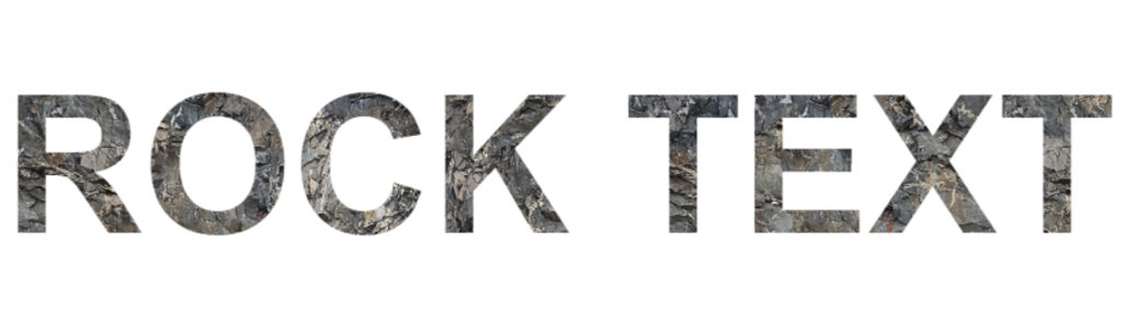
Here’s the HTML code:
<canvas id="canvas" width="1000" height="300" >ROCK TEXT</canvas>
To which we add this simple CSS code:
canvas{font-size:10em;font-family:sans-serif;font-weight:bold;background-image:url(//www.textures4photoshop.com/tex/thumbs/rocky-mountain-texture-seamless-thumb31.jpg);background-size:0 0;}
The font and background settings do not affect the canvas directly.
We will use them in the JavaScript code. So, if we will want to change the font or texture image we will only change the CSS.
Notice that I set the background-size to 0. I did that because I don’t want the canvas to have a background. I only need the background-image property to use in the CSS.
The real magic happens in the JavaScript code:
var canvas = document.getElementById("canvas");var ctx = canvas.getContext("2d");var img = document.createElement("img");img.src=window.getComputedStyle(canvas).backgroundImage.slice(4, -1).replace(/"/g, "");img.onload= function(){drawText();}function drawText() {ctx.font = window.getComputedStyle(canvas).font;ctx.fillStyle = ctx.createPattern(img, 'repeat');ctx.textAlign = 'center';var x = canvas.width/2, y=0;ctx.fillText(canvas.textContent, x,200);ctx.fill();}
The code is rather simple. We use getComputedStyle to grab the texture image and the font information from the CSS.
We then simply load the image, and when it’s loaded we use fillText to write the text using the image as a pattern. The text that we write on the canvas is taken from the canvas element using canvas.textContent.
That’s it! And the result looks like:
See the Pen Rock Textured Text Using Canvas by Ion Emil Negoita (@inegoita) on CodePen.
Conclusion
Congratulations! You’ve just learned how to add texture on text using CSS and HTML.
After mastering text effects with CSS, consider exploring tools that simplify visual creation, such as generating unique name coloring pages.