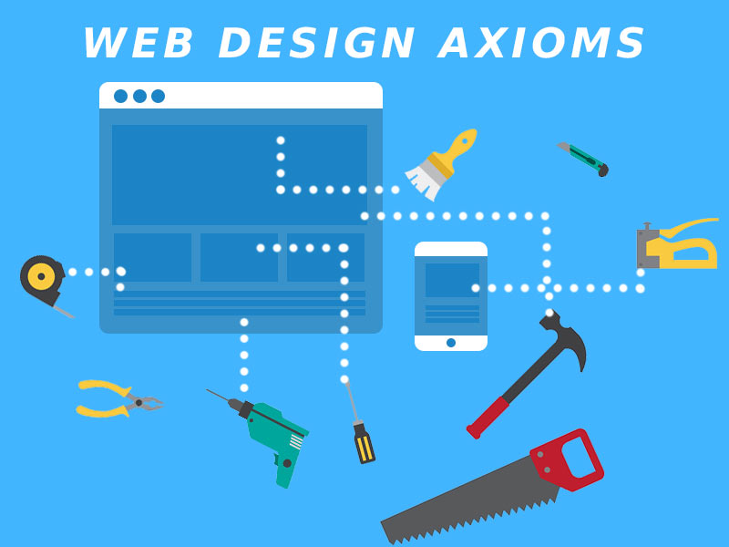
What Are Web Design Axioms?
Web design axioms are principles of design regarded as being well established, widely accepted or self evidently true. In other words, axioms dictate how web design should be in order to avoid confusing the users.
Why is this important?
Bad design, makes bad user experience (UX). And in the end, that is bad for everybody: users, clients and web designers.

In this post I will enumerate some of the basic design axioms you should keep in mind when designing a website. If you know how your users think then it’s easy to design for them.
Always keep this in mind,
People are better with things that they are used to. It’s good to innovate, but it’s enough to make only one design choice that confuses the end users, and you could loose them for good.
Without further ado, here’s my list of basic design axioms you should never ignore:
- Search Bar UX Best Practice
- Website Logo Link To Homepage
- Website Navigation Position
- Login Link Position
- Shopping Cart Position And Icon
- Switching Languages
- The Login Form Design Axiom
You can use this web design principles checklist whenever you design or redesign an existing website.
DESIGN AXIOM #1
Search Bar UX Best Practice
Always place the site search box on the top.
Look,
Users always expect for the search bar or search box to be on the top of the page. If you place it somewhere else, the user will get frustrated and annoyed. That will take him one step closer to leaving your website.
Don’t ignore this web design principle:
We all are comfortable with known things. You have to be aware of the user psychology and use it for design psychology.
So, that’s design axiom #1: place the search bar on the top of the page. Top right is even better on desktop screens. On mobiles you can place it on the top occupying the full width of the screen.
If you have a good reason for placing the search bar in a different location, do it, otherwise simply DON’T.
Bad UX Example
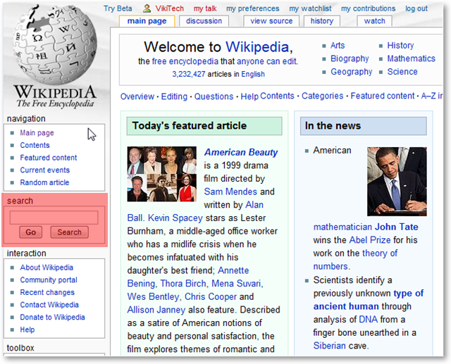 Let’s see a bad UX example from Wikipedia‘s old design. Let’s be honest, if I hadn’t marked the search bar with red, how long would you have taken to find it?
Because people are used to the search bar being on the top, they will instinctively go there. When they don’t find it, they are about 2 seconds away from leaving the site.
There’s also another thing:
There are 2 buttons under the search bar:
- Go
- Search
Needless to say, that only adds to the confusion. The Go button apparently took the user to the page of whatever was typed in the field, while the Search button searched in all pages for reference of the keywords. Pfff, that is really bad.
Of course, Wikipedia is Wikipedia, so this bad UX example worked for them for a long while. Even if this went against the web design principles we call axioms of web design.
But, let’s be clear about this:
They for sure realized that this, and the changed it.
Better UX Example
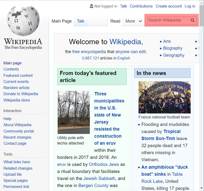
If you now look at the Wikipedia pages, you will see that they have moved the search bar to the top right. Problem solved.
DESIGN AXIOM #2
Website Logo Link To Homepage
Clicking on the website logo always takes the user to the website homepage.
For desktop or for mobile devices, the user expects the same:
The logo of a website is a link to the homepage. Clicking on it always takes the user to the homepage. If it does not the user will be very annoyed. If you’re not sure about how to make a logo for your site, you can simply create a fancy name design with the name of your site and make that into a logo.
This is one of the older web design principles that is still valid, even in 2018.
DESIGN AXIOM #3
Website Navigation Position
Website navigation menu is always on the top or on the left.

All websites have a structure. To allow the users to visit the pages of a website that structure is accessible via the navigation menu.
The user knows that, and they also expect the menu to be either on the top or on the left. Anything else will require them to adapt.
I know what you will say,
You want to be creative and you want to do it differently. And that is certainly your right. Axiomatic design is the norm and there are always exceptions.
Just keep this in mind,
You have to be 100% sure that your creative choice for placing the website navigation in a different position will sit well with all your visitors. Otherwise, you will have split the audience in 2: those who like it and stay and those who don’t and leave the site.
DESIGN AXIOM #4
Login Link Position
Login link is always in the top right corner of the page.
Tweet Web Design Axiom #4: Login Link Position
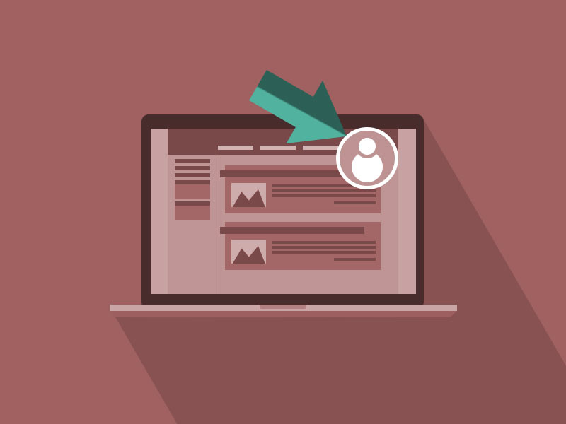
This is a no-brainer:
User wants to login and instinctively they will go to the top right of the screen. They will look for a Login or Sign In link. Or maybe an icon of a user, lock, etc. There are variations on how the link looks, but one things is constant: they will look for the login link in the top right corner of the page.
Psychologically speaking, the brain works like this:
The login action is seen as an inconvenient necessity. The user knows the login is necessary to protect his data, but it’s just another extra action that takes a bit of their time.
Nobody goes to Facebook for example just to log in, right? They go there to read what their friends are doing, to post a photo of their cat, etc.
So the log in is seen as something outside the purpose of using the website. Because of that the brain will put the login action in a “box”.
That box is stored away, just like a box of old magazines, for all websites. And spatially, the brain locates that box always in the top right corner. When it needs to use the box, instinctively it will go to that corner, and if the link is not there… UX breakdown.
Think about it,
It’s just effective web design, if a user takes more than two seconds to do an action that he’s done hundreds of times on other sites, he will just leave. And that, just because the login link was in a different position.
DESIGN AXIOM #5
Shopping Cart Position And Icon
The shopping cart link is always in the top right corner of the page and uses a cart or basket icon.
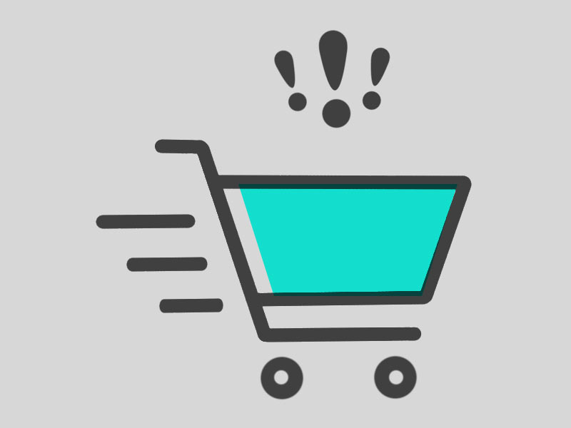
If your website has an online shop then buyers will expect this:
The shopping cart and all products added to it should be accessible via a link in the top right corner. That’s where people are used to find it, and that’s where you should put it.
What about the icon?
Well, the generally accepted icon for it is a shopping cart or a basket. There are multiple variations on the look of the shopping cart icon:
![]()
Icons have to be easily recognized. Of course you are free to get creative regarding the design of the icon, but don’t overdo it.
And another thing,
Not necessarily for the shopping cart, but for icons in general. You need to know your audience. Age, geographical location, cultural background, etc are important factors.
There’s a joke on the internet, that I find eye-opening for this.
It’s actually something a guy tweeted:
![]()
Basically, when a young kid saw an old floppy disk thought it’s a 3D print of the save icon.
The moral?
Well, the save icon was originally designed to look like a floppy disk. In the mean time the floppy disks have become history, but the icon still looks the same.
So, when designing, you need to be absolutely sure that your audience will understand your design language.
DESIGN AXIOM #6
Switching Languages
Language switch button is always on the top right of the page and it’s either a flag, or the name of the language

If you have a multi language website you want to give the user the option to switch between available languages.
Of course, many websites automatically switch language according with the user location and local settings. But, what if the user is on vacation and not using their own computer. They will need to change the language.
The user does not like the feeling of being lost. Already there’s a little bit of that feeling when browsing a website that is not in their own language.
So, trust me,
You want to put the language switch icon in the top right corner of the page. Use the names, codes or the flags associated with the languages. That is what people expect, that is what they are used with.
Anything else will require extra cognitive processing, and though that sounds good, it’s actually bad for UX.
Oh, and another thing,
As you probably noticed, there are a lot of things that need to be in the top right corner of the page. That’s one of the UX design challenge that requires some creative solutions. If done well, users will love you for it.
DESIGN AXIOM #7
The Login Form Design Axiom
Login forms always have a user or email field, a password field and one login button in this order
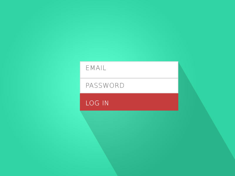
Users do it several times each day. They log into their computers, their email accounts, their Facebook account, etc.
Just remember,
Users are used to logging in by inputting their username or email, their password and then clicking login. That’s it, and in this order.
Don’t mess around with this process, or, you will end up with a confused user.
You want your design to be effective. So, just follow this web design axiom and you will be fine.
To recap,
First user name or email field, then the password field and then the log in button (sometimes called sign in). If you are looking for pre-designed solution for this, check out my list of Bootstrap login form snippets and other Bootstrap snippets.
And Now I Want To Hear From You

For sure you were aware of most of these web design axioms. But, my point is that it’s way better to follow a checklist with these web design principles, rather than go by ear.
Did you find these web design axioms useful? If so, I’m curious to hear about examples of bad UX you fixed using one of these axioms.
Also, I’m sure there are motivated exceptions to all the axioms in this post. Let me know about them by dropping me a comment.


useful post.. very helpful..
thanks.. keep updating with such valuable post.