
In this CSS tutorial I will show you how to create a heart shaped bokeh CSS effect. You can use the same code to create the CSS bokeh effect with other shapes too.
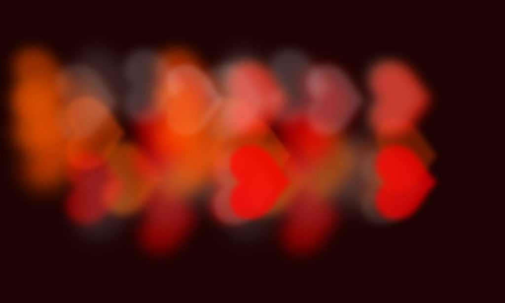
This is the bokeh CSS effect we will make:

For the impatient readers:
- Codepen Heart Shaped Bokeh
- Gist on Github
- Heart symbol copy/paste full list
- Other copy/paste text symbols from MockoFun
What is bokeh?
In photography, bokeh is the aesthetic quality of the blur produced in out-of-focus parts of an image. Bokeh has also been defined as “the way the lens renders out-of-focus points of light”. Differences in lens aberrations and aperture shape cause very different bokeh effects. Read more on Wikipedia if you are interested.
How To Make A Bokeh CSS Effect?
The main idea behind creating bokeh is to have some elements that are out-of-focus or blurred. CSS offers out of the box a blur filter.
To add blur to an element, simply say filter:blur(radius). The radius indicates how much blur you want the element to have and is usually indicated in pixels, but other measure units work too. Read more about the blur filter in the MDN Web Docs.
Bokeh also refers to points of light. So, we will need to have several elements that are blurred, but also highlighted somehow. We can use another filter for this: the brightness filter. The syntax for this is filter:brightness(amount). See the full documentation here.
We’ll also need a way to color each “point of light” differently.
So, let’s start writing some code.
The Bokeh HTML Code
We need a wrapper and a few divs which will represent the bokeh points of light.
<div class="bokeh">
 <div/>
 <div/>
 <div/>
 ...
</div>
Basically, we will need a div for each point of light that creates the bokeh CSS effect.
That’s it!
Now, for some fancy CSS
The Bokeh CSS Code
You could write the bokeh effect using only CSS, but you won’t have any “randomness” to it everytime you load it. For a website, that might be fine, but for the sake of this tutorial I will use SCSS.
If you don’t know what SCSS is, then think about it like CSS in which you can write dynamic code. Check out what you can do with SCSS here.
First let’s setup the bokeh effect wrapper:
.bokeh {
  width: 100vw;
  height: 100vh;
  position: relative;
  background: #1d0302;
  overflow: hidden;
}
Nothing fancy yet, just some dark area that should cover the entire screen.
Next we’re going to define constant variables for this project.
- Number of the particles – This should be the same as the number of div elements you have
- Particle size – How big you want the points of light to be
- Base Opacity – Create transparent effect. We’ll add this with random value later
- Base Brightness – Again, we’ll add this with random value later.
- Color set – List of colors for the points of light
$bokehCount: 25;
$bokehBaseSize: 11rem;
$bokehBaseOpacity: 0.45;
$bokehBaseBrightness: 200;
$colorSet: (
  rgba(224,0,0,0.8),
  rgba(255,123,123,0.2),
  rgba(96,27,0,0.7),
);
Ok, so we have some variables and some values. Now, let’s use them!
First, we’ll use position absolute for each div inside the bokeh wrapper.
.bokeh div {
  position: absolute;
  border-radius: 50%;
}
Then using SCSS, create a loop to iterate through each div. Here we’re going to start adding randomized value. First I’m going to create a randomizedSize which is the base size plus the random value – use it to set width and height. Next set top and left to random value within 0 to 100% boundary.
@for $i from 1 through $bokehCount {
    &:nth-child(#{$i}) {
      $randomizedSize: random() + $bokehBaseSize;
      &:after{
        content:var(--emoji-shape);
        font-size: $randomizedSize;
      }
      width: $randomizedSize;
      height: $randomizedSize;
      top: random(50) * 1vh;
      left: random(50) * 1vw;
      color: nth($colorSet, random(length($colorSet)));
      opacity: $bokehBaseOpacity + random(4) * 0.15;
      text-shadow: ($randomizedSize + 5rem) 0 (0.2rem + random()*0.5rem) currentColor;
      filter: blur(random(10)*2px) brightness($bokehBaseBrightness + random(250)*1%);
    }
  }
This code basically offsets the bokeh points of light by a random amount. Also, each point of light will have a different color assigned at random from the $colorset variable.
The &:after CSS rule adds a text pseudo element of random size with the content set via a CSS variable. If you don’t know how CSS variables work, check out this W3Schools article about it. In short, you can set a custom CSS property and you can use the value of that property as a variable in elements for which the CSS rule apply.
In our case, the --emoji-shape CSS variable holds the character or text we use for the bokeh light shapes. Set this variable at the bokeh effect wrapper div and use its value in the divs below.
Also in the CSS code, observe setting different colors, opacity, blur and brightness values for the individual bokeh points of light.
A bit of bokeh JavaScript
To make our lives a bit easier, let’s sprinkle some bokeh JavaScript.
Assuming that we use jQuery, let’s create the divs for the boke points of light dynamically like this:
const bokehCount = 25;
const $bokeh = $(".bokeh");
for (var i=0;i<bokehCount;i++){
  $bokeh.append($("<div/>"));
}
Also, we can change the heart symbol used for the bokeh lights using this code:
const heartSymbols = [..."♥❤♡❥❦❧♥"];
var idx = Math.round(Math.random()*(heartSymbols.length-1));
var symbol = heartSymbols[idx];
$bokeh.css({"--emoji-shape":`'${symbol}'`})
This code simply sets the --emoji-shape value to a heart symbol from the heartSymbols array.
Notice the ... (three dots JS operator) which is called a “spread operator”. Basically this turns the string containing the heart text symbols into an array that can be accessed by the idx index.
You might be wondering why I did it this way and not simply use the string directly as an array or use the String.charAt() function?
Here’s why:
The heart text symbols used are Unicode characters and using the String.charAt() function simply doesn’t work for some of them. You give it a try with this one for example ❥
And now, for the impatient readers:
Here’s the full working code
- Codepen Heart Shaped Bokeh
- Gist on Github
- Heart symbol copy/paste full list
- Other copy/paste text symbols from MockoFun
See the Pen Heart Shaped Bokeh by Ion Emil Negoita (@inegoita) on CodePen.
In conclusion
To make bokeh with CSS you only need a few lines of CSS. Use SCSS for quicker and more dynamic results. Also, you can use some JS to get things up and running event quicker. A bit of CSS blur filter here, some pseudo elements with text symbols there and you get some pretty neat bokeh CSS effects.
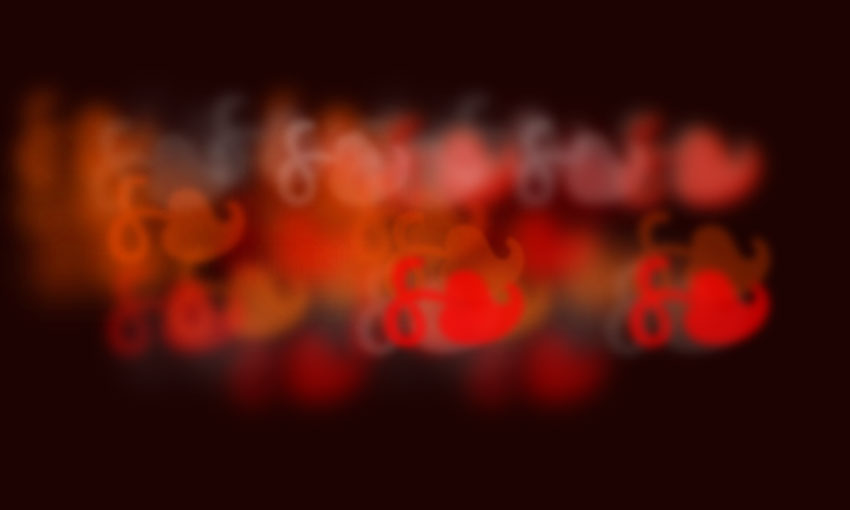
And a few different results for the CSS bokeh effect:
