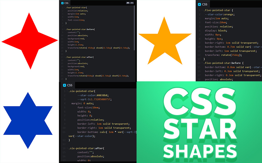
CSS star shapes can be made using very basic CSS code. Making a CSS star shape is very useful for a number of purposes from making a CSS star rating system, to paragraph dividers, bullet list decorators, star icons and more.
In this short article I will show you give you all the tools and code for your own CSS star shape generator. I like to play around with CSS shapes and applications for various CSS shapes in web design. Check out my tutorial on CSS circle image cropping to see a very cool effect.
Star Symbols ★✬✯
There are many shapes that are referred to as star shapes. They have variable number of tips (points), they’re empty or filled, rounded or sharp, etc. Each of them might have a different meaning.
Usually on websites, the star symbol is associated with something of premium value or most of the times they are used for ratings or reviews. A CSS star rating system has the advantage of being very light weight – improving the load time and overall performance of the page where it’s used. Use this with the technique from the CSS badges and you can get a really cool star rating badge for your site.
How do you add a star symbol in CSS? You can just copy/paste star shaped characters like ★✬✯ from this complete list of star symbols or read on to find out how to actually build or draw CSS star shapes.
Four Pointed Star CSS
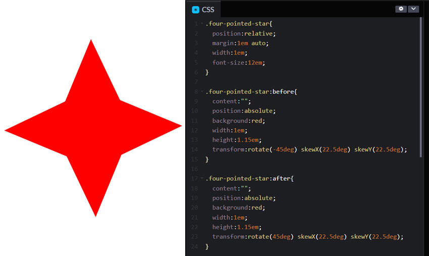
To make this 4 points CSS star shape you simply need to overlap 2 square shapes that are slightly squeezed using the skew() CSS transformation. When overlapped, one is rotated 45deg and the other rotates -45deg.
Here’s the HTML:
<div class="four-pointed-star"></div>
and CSS code:
.four-pointed-star{
  position:relative;
  margin:1em auto;
  width:1em;
  font-size:12em;
}

.four-pointed-star:before{
  content:"";
  position:absolute;
  background:red;
  width:1em;
  height:1.15em;
  transform:rotate(-45deg) skewX(22.5deg) skewY(22.5deg);
}

.four-pointed-star:after{
  content:"";
  position:absolute;
  background:red;
  width:1em;
  height:1.15em;
  transform:rotate(45deg) skewX(22.5deg) skewY(22.5deg);
}
Here’s the live preview:
See the Pen CSS Star: 4 Pointed Star ✦ by Ion Emil Negoita (@inegoita) on CodePen.
Or check out this Github gist.
To change the color of the star, modify the background color for the 2 classes. The size for this CSS star can be changed by setting a different font-size for the .four-pointed-star CSS class.
Five Pointed CSS Star
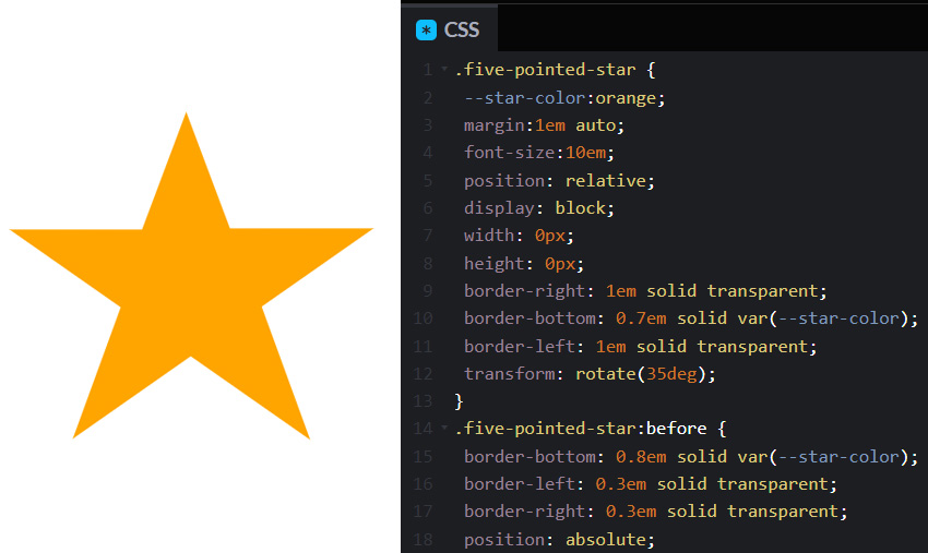
Let’s see how to make a classic 5 pointed CSS star shape.
Basically, we need to overlap 3 triangles. CSS triangles are made using a combination of colored and transparent borders.
In one of my old posts I covered how to make CSS triangle shapes, so give that a quick look if you don’t know this technique.
Here’s the HTML code for this 5 pointed CSS star:
<div class="five-pointed-star"></div>
and the CSS code:
.five-pointed-star {
 --star-color:orange;
 margin:1em auto;
 font-size:10em;
 position: relative;
 display: block;
 width: 0px;
 height: 0px;
 border-right: 1em solid transparent;
 border-bottom: 0.7em solid var(--star-color);
 border-left: 1em solid transparent;
 transform: rotate(35deg);
}
.five-pointed-star:before {
 border-bottom: 0.8em solid var(--star-color);
 border-left: 0.3em solid transparent;
 border-right: 0.3em solid transparent;
 position: absolute;
 height: 0;
 width: 0;
 top: -0.45em;
 left: -0.65em;
 display: block;
 content:"";
 transform: rotate(-35deg);
}
.five-pointed-star:after {
 position: absolute;
 display: block;
 top: 0.03em;
 left: -1.05em;
 width: 0;
 height: 0;
 border-right: 1em solid transparent;
 border-bottom: 0.7em solid var(--star-color);
 border-left: 1em solid transparent;
 transform: rotate(-70deg);
 content:"";
}
You might be wondering what’s the deal with the property --star-color. It’s not a standard CSS property.
Properties starting with -- (CSS double minus) are CSS variables. You can define variable values just like regular CSS properties, and then reuse them in your CSS code. This has the advantage that you will only have to change the value in one place and it will be applied everywhere the variable was used.
In our case, we have 3 triangles and they get the color from this --star-color variable. So, that’s where you can actually change the color of the CSS star shape.
You can experiment with the CSS code here:
See the Pen CSS Star: 5 Pointed Star ★ by Ion Emil Negoita (@inegoita) on CodePen.
or copy/paste the CSS star code from this Github gist.
Six Pointed Star in CSS
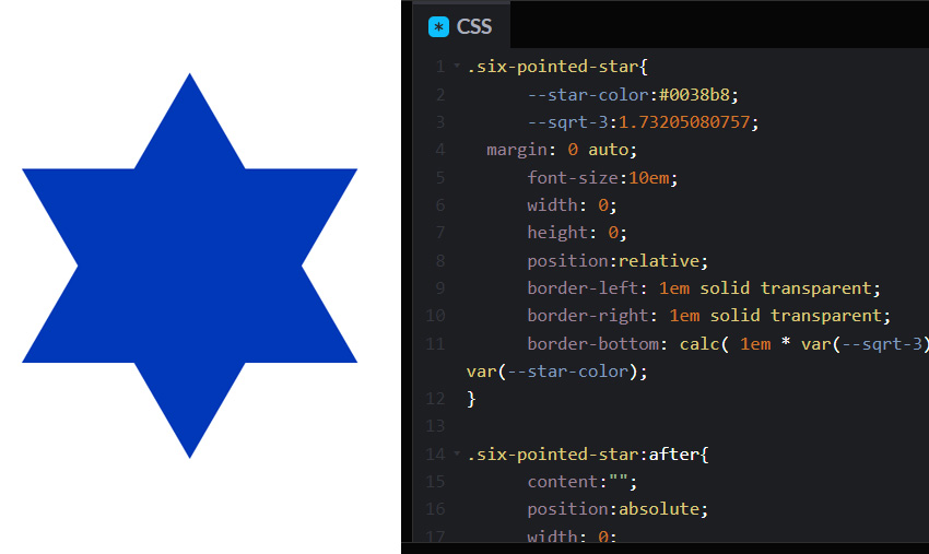
We’ve seen the four pointed star, five pointed star and now let’s see how to make the six pointed star with CSS.
The six pointed star, also known as a hexagram or the star of David is made up of two overlapping equilateral triangles (three equal sides). If you want, you can draw this in Photoshop and you can learn here how to make a triangle in Photoshop. But, you’re here to see how to make a hexagram with CSS.
We’ll need a bit of math. Actually, you won’t because I already did it for you. We will draw the CSS equilateral triangle using borders again, and we need to figure out how tall the triangle has to be in order to make it equilateral.
Basically, an equilateral triangle with the side length equal to L has a height equal to L * √3 / 2.
But how do we put calculations in CSS. Check out the code below and then I will explain.
The HML code:
<div class="six-pointed-star"></div>
and the CSS code:
.six-pointed-star{
      --star-color:#0038b8;
      --sqrt-3:1.73205080757;
  margin: 0 auto;
      font-size:10em;
      width: 0;
      height: 0;
      position:relative;
      border-left: 1em solid transparent;
      border-right: 1em solid transparent;
      border-bottom: calc( 1em * var(--sqrt-3) ) solid var(--star-color);
}

.six-pointed-star:after{
      content:"";
      position:absolute;
      width: 0;
      height: 0;
      left:-1em;
      top:calc( 1em * var(--sqrt-3) / 3 );
      border-left: 1em solid transparent;
      border-right: 1em solid transparent;
      border-top: calc( 1em * var(--sqrt-3)  ) solid var(--star-color);
}
As you can see we are using CSS variables again. Also we are using calc for CSS calculations. With calc you can do calculations using the various units in CSS (px, em, rem), you can even use variables and there are even some math functions that you can use.
We need to use the square root of 3, unfortunately there is no CSS function for calculating the square root, but, we can embed the value for the square root of 3 as a variable.
Then we use this variable to calculate the height of the equilateral triangle with the side of length 2em like this border-bottom: calc( 1em * var(--sqrt-3) ) solid var(--star-color). For simplification instead of dividing 2em to 2 I’m using 1em directly.
For the upside down overlapping triangle, we have to offset it by a third of the triangle height like this top:calc( 1em * var(--sqrt-3) / 3 )
To modify the size of the six pointed star simply change the font size. As for the color you can adjust if by changing the --star-color variable.
Here’s the Codepen to play around with this CSS star:
See the Pen CSS Star: 6 Pointed Star ✶ by Ion Emil Negoita (@inegoita) on CodePen.
And the Github gist.
In Conclusion
If you need to throw a star or to in your HTML code, now you know how to make a CSS star. If you have any questions or extra tips on how to create other types of stars in CSS, be a good sport and drop me a comment below.