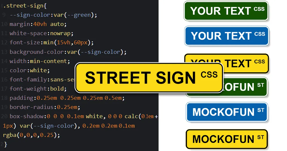
Street signs are an essential part of urban landscapes, guiding us through cities and neighborhoods. But have you ever wanted to create your own unique street sign for a special occasion or just for fun? In this tutorial, we’ll show you how to design a stylish street sign using HTML and CSS, and even customize it by changing its color. This tutorial is inspired by the free online template Street Sign Maker available on MockoFun, an online graphic design application that makes creative design easy.
Getting Started with HTML
Let’s start with the HTML structure for our street sign. We’ll keep it simple and use a <div> element with the class “street-sign”. Here’s the HTML code:
<div class="street-sign">MOCKOFUN</div>In this example, we’ve used the text “MOCKOFUN” for our street sign, but you can replace it with any text of your choice.
Styling with CSS
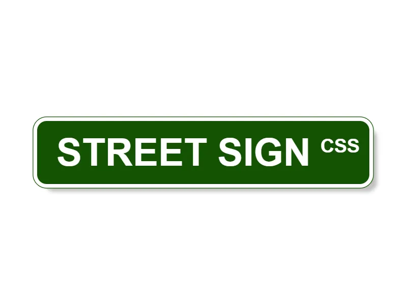
Now, let’s dive into the CSS code that will make our street sign visually appealing and customizable. We’ll use CSS variables to make it easy to change the sign’s color. Here’s the CSS code:
:root {
  --green: #145203;
  --blue: #0561ad;
  --yellow:#FDDA16;
  --white:#FFFFFF;

  --superscript: "ST";
}

.street-sign {
  --sign-color: var(--green);
  margin: 40vh auto;
  white-space: nowrap;
  font-size: min(15vh, 60px);
  background-color: var(--sign-color);
  width: min-content;
  color: white;
  font-family: sans-serif;
  font-weight: bold;
  padding: 0.25em 0.25em 0.25em 0.5em;
  border-radius: 0.25em;
  box-shadow: 0 0 0 0.1em white, 0 0 0 calc(0.1em + 1px) var(--sign-color), 0.2em 0.2em 0.1em rgba(0, 0, 0, 0.25);
}

.street-sign::after {
  content: var(--superscript);
  font-size: 0.5em;
  vertical-align: super;
  margin-left: 0.5em;
}

.street-sign.inverted{
  color:black;
  box-shadow:0 0 0 0.1em black, 0 0 0 calc(0.1em + 1px) var(--sign-color), 0.2em 0.2em 0.1em rgba(0,0,0,0.25);
}
Let’s break down the key components of this CSS code:
- CSS Variables: We define color variables,
--green,--blue,--yellowand--whitewhich can be customized to change the sign’s color. Additionally, we define a--superscriptvariable for the superscript text (e.g., “ST”). .street-signClass: This class styles our street sign. Here are some important style details:--sign-color: This variable determines the background color of the sign. By default, it’s set to--green, but you can easily change it to--blueor any other color you prefer.margin,white-space, andfont-sizeproperties control the sign’s positioning and text size.background-colorsets the background color based on the--sign-colorvariable.colordefines the text color as white.font-familyandfont-weightdetermine the font used and its weight.padding,border-radius, andbox-shadowadd stylistic details to the sign.
.street-sign::afterPseudo-element: This pseudo-element allows us to add a superscript (e.g., “ST”) to the sign. You can change the--superscriptvariable to display different superscript text like “ROAD”, “RD”, “W”, “AVE”, “BLVD”, etc..street-sign.invertedClass: is a CSS class that you can add for the yellow and white signs. These street signs will have a black text color and black border.
Here’s a quick explanation about the code for the street sign border. In this case I’ve used CSS shadows, but if you read my CSS Stroke Definitive Guide you’ll see there are many other ways to achieve this.
.box-shadow: 0 0 0 0.1em white, 0 0 0 calc(0.1em + 1px) var(--sign-color), 0.2em 0.2em 0.1em rgba(0, 0, 0, 0.25);In this line of CSS code, you’re applying multiple box shadows to the .street-sign class to achieve a stylish border effect around the sign. Let’s break down each part of this box shadow:
- First Shadow:
0 0 0 0.1em whitethis is the white border of the street sign.0for the horizontal offset: This means there is no horizontal offset, so the shadow appears directly behind the element.0for the vertical offset: Similarly, there’s no vertical offset, so the shadow is right behind the element.0for the blur radius: The blur radius is set to zero, which means the shadow has a sharp edge.0.1emfor the spread radius: The spread radius creates a border-like effect by expanding the shadow by a small distance of0.1em.whitefor the shadow color: This part of the shadow is white, which creates the appearance of an inner border.
- Second Shadow:
0 0 0 calc(0.1em + 1px) var(--sign-color)this is the outside edge of the street sign which is the same color as the street sign itself.0for the horizontal and vertical offset: No horizontal or vertical offset is applied.0for the blur radius: There’s no blur effect.calc(0.1em + 1px)for the spread radius: This dynamically calculates the spread radius to be slightly larger than the previous shadow, creating an outer border effect.var(--sign-color)for the shadow color: This part of the shadow takes on the color defined by the--sign-colorvariable, allowing you to customize the border color.
- Third Shadow:
0.2em 0.2em 0.1em rgba(0, 0, 0, 0.25)this is an extra effect creating a diffuse drop shadow effect for the entire street sign.0.2emfor the horizontal offset: A slight horizontal offset of0.2emgives the appearance of a shadow to the right and below the sign.0.2emfor the vertical offset: Similarly, a vertical offset of0.2emcreates a shadow to the right and below the sign.0.1emfor the blur radius: This adds a subtle blur effect to the shadow.rgba(0, 0, 0, 0.25)for the shadow color: The shadow is semi-transparent and dark, which creates a shadowed effect to give depth to the sign.
In summary, by combining these multiple box shadows, you create a visually appealing border effect for the street sign. The first shadow is an inner border, the second shadow is an outer border, and the third shadow provides a subtle drop shadow effect, resulting in a polished and stylish appearance for the sign.
Customizing the Street Sign’s Color
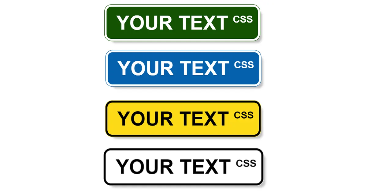
To customize the sign’s color, simply change the value of the --sign-color variable in the :root section of your CSS. For example, to make the sign blue, update it like this:
:root {
  --green: #145203;
  --blue: #0561ad;

  --superscript: "ST";
}
.street-sign{
  --sign-color: var(--blue); /* Change to blue */
...
You can experiment with different color values to create a street sign that matches your preferences or the theme of your project. For some light colors you might need to use the .inverted CSS class in order to have a black text and border.
Try it on CodePen!
Want to see and experiment with this street sign project in action? You can find the code on CodePen. Feel free to customize it, change the text, or explore different color options right in your browser. Have fun designing your own street signs!
See the Pen Stree Sign Generator by Ion Emil Negoita (@inegoita) on CodePen.
Conclusion
Creating a stylish and customizable street sign using HTML and CSS is a fun way to add a personal touch to your web projects. This tutorial, inspired by MockoFun’s street sign template, provides a solid foundation to get you started. Whether you want to design a playful sign for an event or add a unique element to your website, have fun designing your own street signs!

