In this short post, we try our hand at creating a simple CSS threshold filter. Just as Photoshop’s threshold fine-tunes images by creating stark black and white contrasts, the CSS Threshold Filter allows you to enhance web elements with striking visual impact. Whether it’s highlighting interactive buttons, crafting captivating overlays, or adding depth to hover effects, this technique works similarly to Photoshop’s tool, ensuring your web designs gain attention-grabbing aesthetics.
What is Thresholding in Image Processing?
Thresholding in image processing is a fundamental technique used to segment an image into distinct regions based on pixel intensity values. It involves setting a threshold value, which serves as a boundary that divides the pixels into two groups: those that have intensity values above the threshold and those that have intensity values below it.
In simpler terms, thresholding converts a grayscale image into a binary image, where each pixel is categorized as either part of the foreground (object of interest) or the background. Pixels with intensity values above the threshold are typically assigned one value (often white), while those below the threshold are assigned another value (often black).
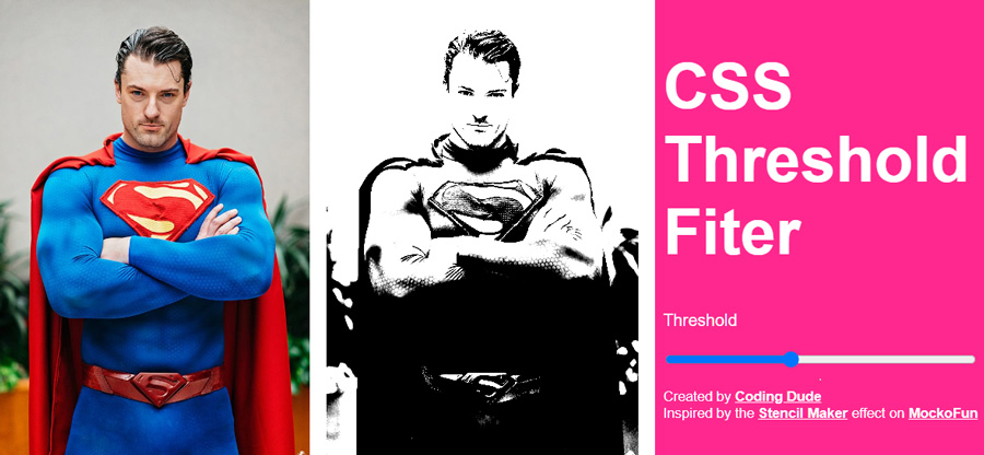
There are many applications that have a threshold tool including Photoshop, GIMP, etc. There are even free online applications that allow you to apply a threshold filter to an image online. For example the stencil maker from MockoFun is a cool example of a free online application. It basically applies the threshold filter to any photo and transforms it into a stencil like the famous Bansky street art designs.

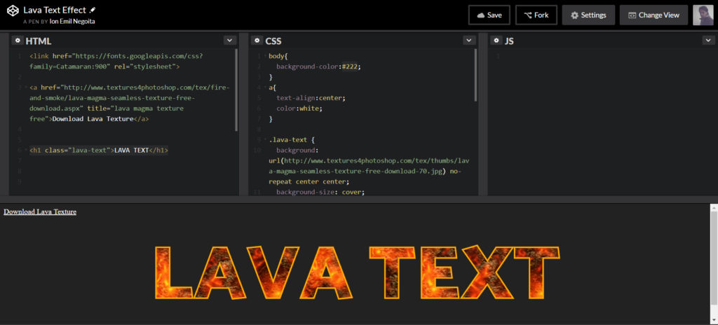
CSS Threshold Filter Code
See the Pen CSS Stencil Filter by Ion Emil Negoita (@inegoita) on CodePen.
Let’s take a simple HTML code for an image:
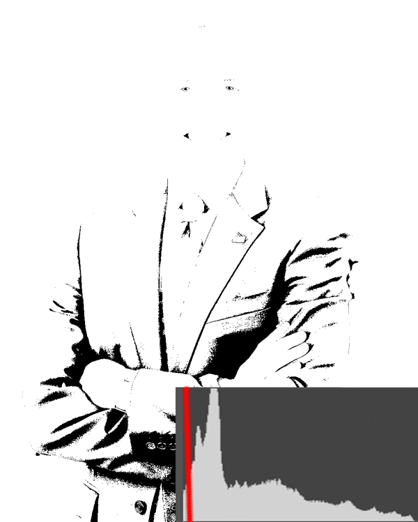
<img src="https://i.imgur.com/r4csVkj.jpeg" alt="CSS Stencil Filter" class="threshold">we’ve added the CSS class name threshold which is where we will place our CSS threshold filter code:
:root{
--threshold:50%;
}

.threshold{
filter: brightness(calc(100% + var(--threshold))) grayscale(100%) contrast(1000%);
}
So, let’s take a look at this code and explain a bit what’s going on.
:root{ --threshold:50%; }
This line sets a CSS variable named --threshold in the root of the document, which acts as a threshold value for the filter. In this case, the threshold value is set to 50%, indicating that pixels with grayscale values below 50% will turn black, and those above 50% will turn white.
This variable is optional, as you could simply put in the value in the .threshold class CSS code, but it’s a convenient way of separating the value for the threshold. This is especially useful if you want to make the threshold dynamic, as I’ve done in my code. Changing the threshold is as easy as changing this CSS variable.
.threshold{ ... }
This CSS class selector targets elements with the class name “threshold” and applies a series of filter effects to them. The effects combine to create the threshold filter.
Let’s break it down:
brightness(calc(100% + var(--threshold))): Here, thebrightnessfilter is used to adjust the overall brightness of the image. Thecalc()function combines the original brightness (100%) with the custom threshold value stored in the--thresholdvariable. This effectively brightens the pixels that are above the threshold value.grayscale(100%): Thegrayscalefilter is applied at maximum intensity (100%), converting the image to grayscale.contrast(1000%): Thecontrastfilter is used to enhance the contrast between black and white pixels by increasing the contrast level to 1000% – a large enough value to produce only black and white pixels, which is what we need for our threshold filter.
In Conclusion
In web design, the CSS Threshold Filter is a very versatile tool for sophisticated photo effects. Using this simple filter you can achieve some really cool effects that will make your designs stand out.
As we conclude this journey, remember that CSS filters are a gateway to limitless creativity. Experimentation is your compass, leading you to explore beyond thresholds. Why not venture into applying vintage photo filters using CSS or merging various filters for breathtaking effects? The canvas is yours to paint, and the possibilities are boundless. Embrace innovation, and let the CSS Threshold Filter be the stepping stone to your design masterpiece. Unleash the power of code to transform the ordinary into the extraordinary, and watch your web designs come alive like never before.